In the previous installment of the ongoing “Baby Got Backend” article series, I wrote about the various tools that Drupal site builders and developers can use to customize the content editing and administration experience. With a well-populated toolbox, the biggest challenge is often figuring out the needs of the people using the site’s backend, and determining what parts of their workflow to focus on.
In this installment, we’re going to take a closer look at a simple example we encountered at Lullabot: a painful speed bump in our site management workflow, a brainstorming session to come up with solutions, and the iterative work to make the fix a reality. The specific problem we encountered wasn’t earth-shattering, and the solution isn’t rocket science, but the process we had to work through is universal.
Step One: Spot the Pain Point
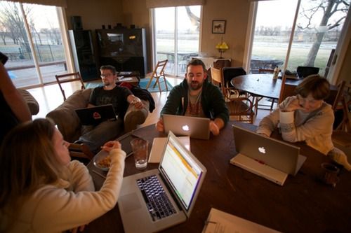
This year before DrupalCon Chicago, the Lullabot crew spent a few days getting valuable face-to-face time, planning for the coming year, and brainstorming about the challenges inherent in running a virtual company. One of the things we all agreed on was that the company web site (this one!) needed more fresh content on a regular basis. Coming up with material wasn’t the problem; we all had ideas in the queue, and more than a dozen “almost finished” articles were already on the site, waiting for the finishing touches. In the scramble of day-to-day work, though, balls kept being dropped and we weren’t getting them out the door in a timely fashion. Everyone was frustrated: it seemed like a simple problem, but repeating “We should just do it!” wasn’t helping.

Over lunch, we asked everyone who’d worked on one of those stalled articles what (other than time!) was blocking them. After just a few minutes, it became clear there were a couple of common stumbling blocks:
- No editor. Quite a few of us worked on the site, but no one person was “in charge” of getting new content published. Questions about style issues, design considerations, and overlap with existing articles, often languished without a clear answer.
- No way to know what’s coming. As unpublished articles accumulated, it was unclear which ones were “in the queue” and which ones were unfinished outlines. Without a central authority on scheduling, it was often tough to know whether publishing an article immediately would steal the spotlight from other announcements in the pipeline.
- No easy way to pitch in. All of the Lullabots loved giving and getting feedback during the editing process, but the only mechanism was shouting, “Help!” in IRC. It worked sometimes, but if not enough people spotted the shout-out, articles were delayed waiting for feedback.
- Too easy to collide. On several occasions, two people had started work on similar articles – only realizing they were duplicating their efforts when they asked for feedback. It wasn’t the end of the world, but collaboration would have been more rewarding.
- Too many options. Our almost-two-year-old design had accumulated over a dozen content types including Events, Workshops, Podcasts, Articles, Blog Posts, Podcasts, Videocasts, and more. As new Lullabots joined the company, they scratched their heads figuring out where to put their writing.
Whew. Like most discussions with the people who produce a web site’s content, it resulted in a laundry list of tricky problems, most of which were unrelated to Drupal. We weren’t hung up on ugly input forms or too many menus, we were frustrated by a clunky process for publishing.
Step Two: Brainstorm Solutions
With our master list of pain points in hand, we started tossing out ideas. The easiest problem to fix was the lack of an editor: the most opinionated person in the room was quickly volunteered. In Open Source, expressing an opinion about a problem means you get to fix it. ;-)
From our conversations, we knew that the early stages of actual article production (brainstorming, first drafts, and so on) often occurred offline. Everyone was excited about the idea of an online whiteboard or wiki to keep track of the embryonic ideas, but concerned that something too complicated would be ignored. Most of the other coordination problems boiled down to giving everyone an easy-to-use view of upcoming articles’ progress.
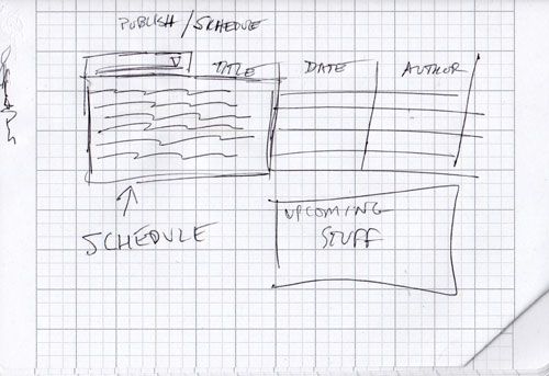
A few minutes with a pen and paper gave us one potential solution: an admin-only landing page that each of us would see on logging into Lullabot.com. It could list “unclaimed” article ideas, show the upcoming content that was ready for review or publication, and give us a starting point for common article types.

Our ideas for a solution were pretty fuzzy at this point, and we knew it wouldn’t solve all of our problems, but the proposed dashboard was simple and focused, easy to implement without a huge time investment, and easy to abandon if it didn’t work out for us. Those factors made it the textbook definition of an “easy win,” and we cracked open Views to start building.
Step Three: Implement it!
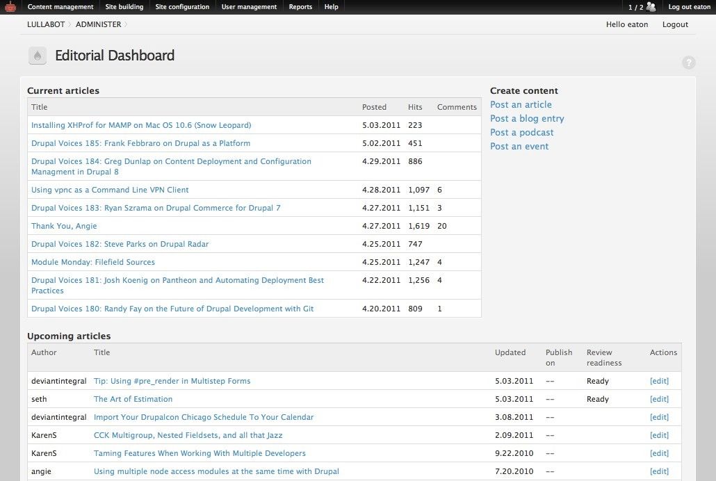
Our first stab was a simple view of articles, sorted by publish date, with a ‘Published/Unpublished’ field indicating whether they were visible to the public. While it was handy, it also became clear that the information we needed to display for current content and the information we needed to display for upcoming content was very different. Quickly, our proposed dashboard split into two views.
The first, our Published Articles view, was the simplest. It listed the latest ten articles on Lullabot.com, who authored them, and quick stats like the number of comments and the number of reads for each article. The second, our Upcoming Articles view, displayed unpublished articles and their scheduled publishing dates. We’ve been using the Scheduler module for quite some time to handle timed publishing of our articles, so the “upcoming publishing date” for each article was already available for us to use in this view.
To help the Lullabots keep track of each articles’ progress during the creation and editing process, we also added a custom Flag called “Ready for Review” to the mix, and included the latest revision message for each article in the view. With those tools, anyone skimming the View can see what articles are completed and ready to be proofed, read notes on the latest edit to each article without clicking to another page, and see what the projected publish date is for each one.

To tie it all together, we created a simple Panel that combines the two views and contains quick links to our most commonly used content types. On one screen, the site’s editor can keep track of what’s in the pipeline; writers can jump to their articles without wading through the normal Drupal admin screens; and other Lullabots proofing and tweaking the articles can quickly get to the screens they care about.
Step Four: Iterate!
The dashboard has served us well since we started using it, and in the first few weeks we spotted some easy improvements Although it was useful, we’d tucked it out of the way at an odd administrative URL. We gave it a prominent link in the site navigation for logged in users, and with the Login Destination module, we turned the dashboard into the site’s default landing page for logged in users. With the Admin Notes module, we’re also adding a quick and dirty whiteboard to the panel. It will let us maintain a very simply list of unclaimed article ideas for writers to pick from when they need inspiration.
We have a few other crazy ideas floating around, including automatically adding items to the article whiteboard based on #hashtags used in our internal discussion system, pushing messages to our IRC bot when an article is ready for review, and so on.
Some of those ideas, of course, are more fun than practical. Continuing to gather feedback from the rest of the Lullabot writing crew has helped avoid wasted work, and keeps us focused on the real goal: making it easier for a virtual team to keep great content flowing.
Conclusions
I’ve attached an exported Feature that gathers up our dashboard’s current functionality to this article. (It requires the Features module, Scheduler, Panels and Views, Flag module, and all the other pieces that we already had installed on our site, but with those in place, it should work pretty smoothly.) If you’ve been reading this far, however, you’ll recognize that the technical side of the process wasn’t the tricky part. Like most site-specific UX and workflow issues, the challenge was identifying the real pain points, understanding the true workflow we needed to support, and finding low-risk ways to improve things quickly. Once we got our first pass out the door, continuing to gather feedback and iterate the tool helped closed the gap between “interesting idea” and “good fit.”
In the future, we’ll explore some of the more complex challenges faced on large client sites, and the custom development work that had to be done on top of existing Drupal tools. Even without that extra work, though, a little bit of listening and a good brainstorming session can go a long way to eliminating the pain points in a Drupal site’s administration section.
What useful utilities have you put together to streamline things on your sites? Feel free to share ideas here!