Like most CMS products that provide structured content modeling tools, Drupal excels at building template-driven pages with consistent layouts. A blog post might use one template and a staff bio another, but as long as the basic shape of the page is consistent, Drupal’s traditional content modeling and page composition tools are usually enough. When it comes time to build special content, though—departmental portal pages, landing pages for ephemeral marketing campaigns, editorial curated topic hubs, and so on—Drupal’s combination of templates and structured content can fall short. In this article, we’ll take a look at the nature of this problem, explain some common (but flawed!) solutions, and outline four solid approaches to “special” pages that work well in Drupal 8.
The shape of the problem
Before digging into solutions, it’s important to understand the standard approach to layout that’s baked into Drupal’s theme system. Simply put, all content on a Drupal page—navigation menus, headers and footers, sidebars, etc.— is exposed as a “block.” The site’s theme provides a series of regions into which those blocks can be placed, and every page template provides markup to place those regions in the page’s markup. One unique block—Main Page Content— is responsible for the primary piece of content associated with a given URL. On most pages, the Main Page Content is a node, but additional blocks with static content, dynamic lists, and custom design components can be created by site-builders or added by custom plug-in modules.
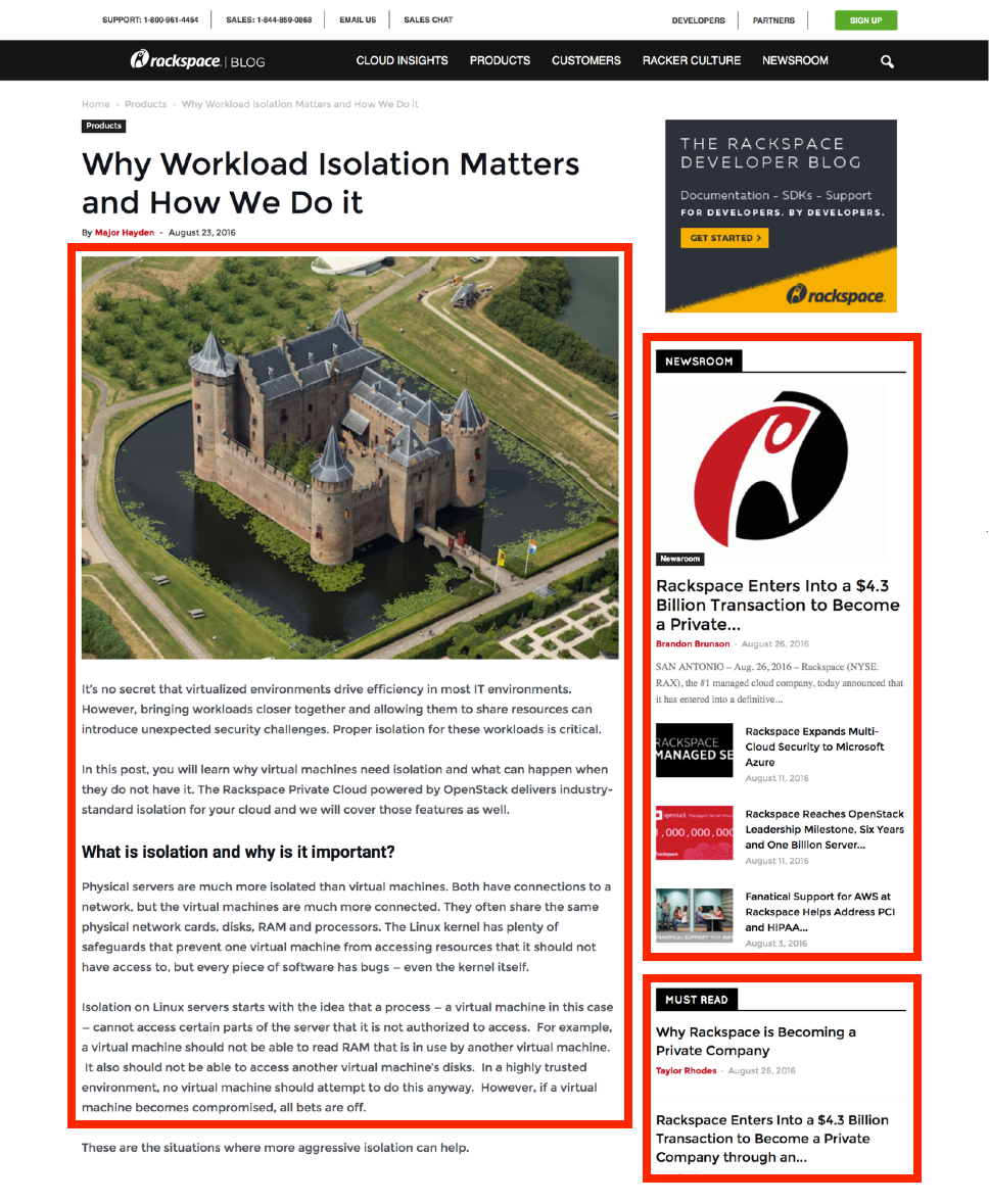
A sample article from the Rackspace website. Red outlines call out the Main Page Content block and two supporting blocks in the sidebar.
The important part, though, is remembering the way a “standard” page works: the page is made of regions, which contain blocks, one of which is the Main Page Content. Usually, that block contains a node, which is made of fields. The types and combinations of those fields will vary based on the content type of the node; a blog post will have different fields than a product data-sheet, for example. For many sites, this works great, but it gets complicated when the structural and presentational needs of a particular piece of content don’t fit a regular pattern of "fields, collected into a node, placed into a region on the page. "In real-world projects, we’ve observed three common scenarios where this occurs:
One-off content
This is the scenario everyone talks about: unique content that’s not really like anything else on the site. It could be the homepage, a special landing page for a month-long marketing campaign, or a single article with particularly complicated supporting content. The common thread is their uncommon-ness and the fact that it makes properly modeling them as structured content difficult. If there are only a handful of them, is it worth the time to plan, design, build, and deploy special content types?
Customizable portal pages
News and entertainment websites often have sections and categories that all function like topical homepages, each with their own rivers of content. Large enterprise and corporate marketing sites have sections representing different product lines, business units, or departments — with key points in their navigation hierarchy serving as home pages in and of themselves.
The “customizable portal” pattern occurs elsewhere, but it differs from one-off content in one important way. Even if there are lots of customizable landing pages, editors and managers want their portal to look different from the others. That might mean a different grid system, a different combination of content modules, a different set of rules for dynamic lists, or a different visual style but it almost always means editors will be in control, rather than designers or developers.
Unknown Requirements
Sometimes, projects require that ad hoc web pages with unknown design and content requirements need to be created and published without the creation of new content types. Often there are patterns present in this content. Unfortunately, the pool of example content in these cases is often so sparse or varied that finding the patterns and predicting whether future content will follow them is a gamble.
Tempting traps
Often, when we encounter clients facing these problems, they’ve already taken a stab at solving them with some of Drupal’s well-known tools. Unfortunately, these “simple” solutions end up being quite complicated.
Content-type proliferation
The most common solution we see on large sites is slow, lava-like growth in the number of infrequently used content types. Need a special page for the company anniversary announcement? Make a custom content type with just the fields it needs. Want to create a blog post with some extra structured data? Clone the existing blog post content type and add the fields. Need to change the look and feel of certain events? Make a special event content type and go to town!
This approach is especially common in large organizations where different teams and departments want to tailor their usage of existing content types, but don’t want to affect what’s already being used elsewhere in the organization. This system can work for a while, but it eventually hits the wall. On one client site, we found no less than three hundred content types that had accumulated this way, with a predictable impact on the complexity of the site’s codebase, theme, and editorial interface.
Let one million fields bloom
Some teams go the opposite direction, squeezing their sites down to a handful of content types but handling variation by adding dozens and dozens of infrequently used fields to each one. It leads to statements like: “To make a special event announcement, create a page node, and set up the 18 display configuration fields as shown in this screenshot…” While it’s possible to load up a content type with choices and settings that map to visual variation, it tangles fine-grain visual design choices into the content model itself. Although it gives more control, it almost always results in an overly-complex editorial experience and requires that the entire content model be scrapped and rebuilt if the design changes.
Raw HTML
When all else fails, it’s tempting to give up and give editors access to raw HTML — perhaps restricted to one content type for “special cases.” Sometimes there’s no other way, but we’ve seen more than a few clients regret throwing open these particular floodgates. First, it assumes that content creators and managers are experienced designers and HTML/CSS jockeys who’ll be able to build unique pages without breaking the site. Second, pages built this way will always break when a new redesign changes the markup, CSS, and JavaScript code used on the site; updating the theme won’t touch the hand-rolled HTML in the special pages. Finally, it makes any reuse, adaptation, or migration of the content insurmountably complicated. Pushing the site back into the era of hand-rolled HTML is absolutely a tool of last resort.
The New Toolbox
If the “quick fixes” are bound to backfire, what tools do make sense for building complex, unique pages on a modern Drupal site? Thankfully, there’s good news on this front. Four mature approaches — each supported by core and the third-party module ecosystem — provide solid solutions in Drupal 8.
Template Swapping
If the underlying structure of your special content is consistent, but you need to adjust the styling and layout of individual pages, Drupal’s standard theming system can still do the heavy lifting. The markup that controls where content blocks appear on the page, and how individual fields are laid out inside of a node, is entirely reliant on theme templates. Custom code in your theme (specifically, hook_theme_suggestions_alter) can examine a given piece of content before it’s rendered and specify a different template if specific conditions are met. Similar techniques allow custom CSS and JavaScript libraries to be added if the current piece of content meets the right conditions.
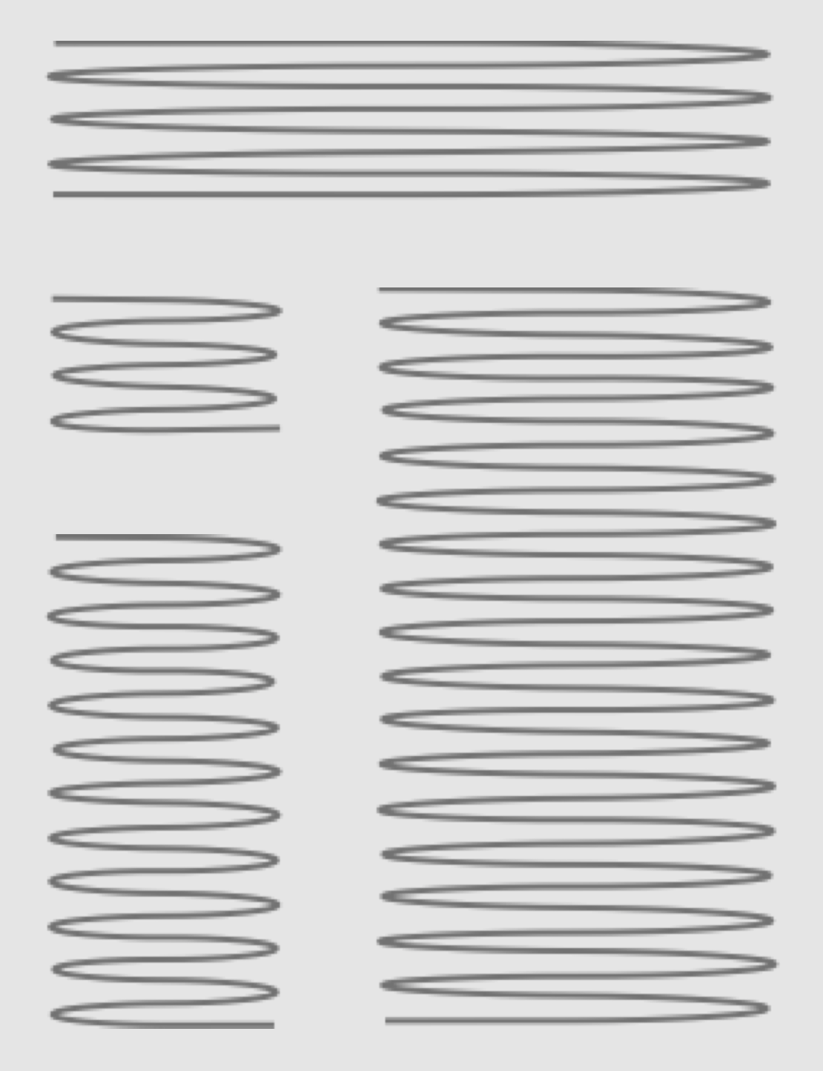
An ideal candidate for template swapping: simple, consistent structure, with an occasional need to reposition or restyle specific elements.
If your editors need direct control over these styling and templating decisions, adding one or two custom fields to a content type is sometimes enough. Populate two list fields with the available layout and style variations, hide them from the final output, then use their values to swap out different page or node templates. Voila!
Pros
- Simple theming trick with stock Drupal
- Easy to explain and preview
- Separates editorial choice from design implementation
- Multi-Channel, Content API friendly
Cons
- Handles presentation variation, not structural
- Too many choices complicate editorial UX
- New variations require development and design work
Stacked Components
When the underlying structure of your unique content varies, simply swapping layout templates isn’t enough. The next step up is a combination of component content types to handle the variation and a container content type to wrap different combinations of components. The component content types define the common structural patterns used across the site, like photo galleries, marketing-focused calls to action, event announcements, and so on. The container content type uses a multi-value reference field to tie multiple components together into a single collection. One container page might stack a “client testimonial” component on top of three “photo gallery” components, while another one alternates between “product feature” components and “call to action” components. Adding new component types is like adding new words to your editors’ page-building vocabulary, expanding the “sentences” they can create inside of a container page.
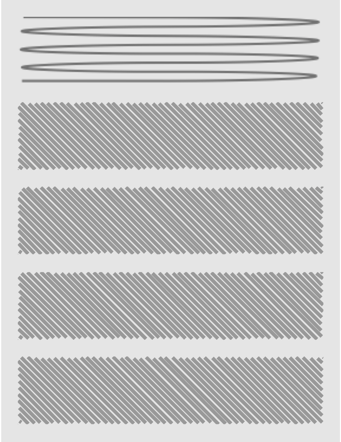
An ideal candidate for stacked components: a linear list of modules containing distinct chunks of content.
Modules like Inline Entity Form are often used to streamline the editorial workflow when this approach is used; without them, content managers would need to create each individual component separately before building the container page. The Paragraphs module is a turnkey version of this approach, and it provides a dedicated entity type for the sub-page components to keep the workflow for “normal” nodes from becoming too cluttered.
Regardless of which Drupal modules are used to implement the stacked component approach, it requires a consistent set of reusable components, as well as design patterns that map well to horizontal slices of self-contained content. Using the component content types to implement more complex grid structures (a “two-up photo-and-text” content component, for example) can easily tie the structure of your content components to the details of your site’s current design. If that changes, your content components will need to be reworked, and all of the pages that use them will need to be recreated.
Pros
- Build with core, or third-party modules
- “Page” agnostic, focuses on relationships
- Layout decisions captured in the content
- Content priority is linear, unambiguous
Cons
- Terrible for flowing textual narratives
- Can produce deeply nested “trees” of entities
- Can lock design decisions into the content model
- Can complicate translation, localization
Entity Embed
Some unique pages are straightforward text except for the complicated bits of structured content that need to live inside of that text. Long-form feature articles with supporting sidebars and media are a common case, and the New York Time’s famous Snowfall article illustrates how impressive it can be when it’s done well. In Drupal, the best solution is similar to the “stacked components” approach described above: individual supporting elements like sidebars, callouts, infographics, and so on are defined as structured content types. Rather than stacking these components on top of each other, however, they’re embedded inside of an article’s body field using the Entity Embed module.
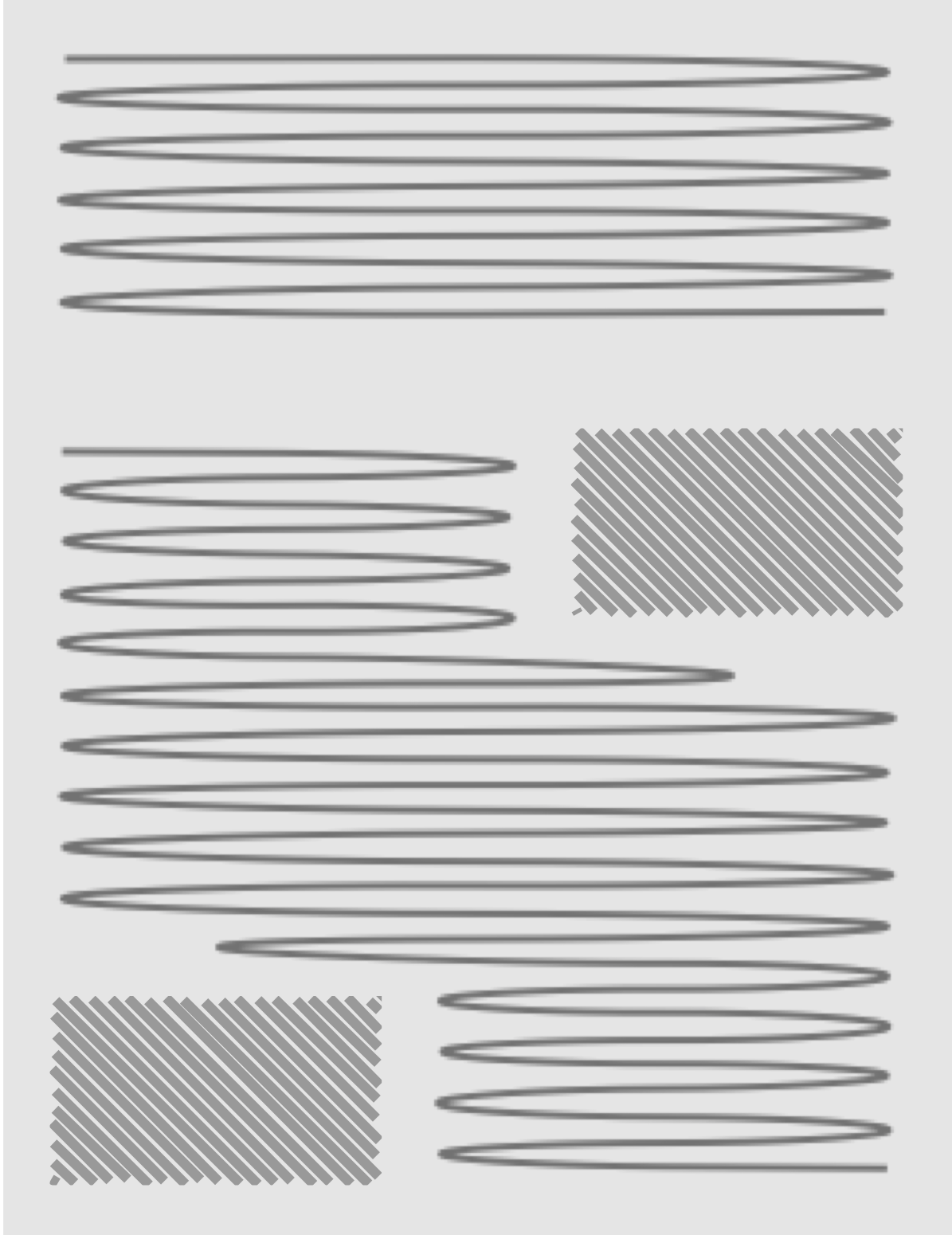
An ideal candidate for entity embedding: narrative text flowing around islands of modular content.
The philosophy behind this approach (as well as its benefits for content reuse) is described in an A List Apart article from 2014. Since then, Drupal’s entity embedding tools have matured considerably. The Media module included in Drupal core uses this technique, and modules like Entity Browser make it possible to pick existing components from a library or create them without leaving the original article’s edit form. When executed well, it combines the fluid flexibility of good ol’ HTML pages with the consistency of well-structured content types.
Pros
-
Preserves narrative flow
-
Keeps complex HTML out of body field
-
Create embeds inside a rich text editor
-
Control display mode, text wrap
-
Pairs well with pattern libraries
Cons
- Requires multiple contrib modules, config
- Workflow states not inherited by embeds
- Requires up-front modeling, theming
- Easy to abuse on “kitchen sink” pages
Layout Builder
If your unique pages need grid-like layouts with multiple columns or need dynamic elements like views and custom blocks alongside more traditional “fielded” content, the next step is Drupal 8’s Layout Builder. It combines the modular approach of stacked components and Entity Embedding with an extensible library of grid layouts: individual nodes can be switched into “Layout Mode,” assigned a particular grid structure, then populated with other content components. It’s a powerful tool, it’s built into Drupal core, and it can be extended with custom plug-ins that add new layout grids, map existing content from structured fields to its library of layout components, and more.
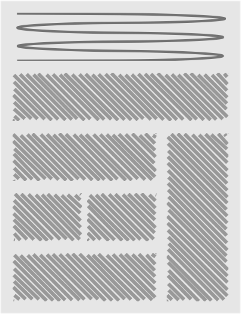
A good candidate for Layout Builder: distinct content components in a unique grid layout.
The downside of Layout Builder is that no inherent relationship is created in Drupal’s content model between the container page and the components that populate it. Building a view that lists all the components that live on page customized with Layout Builder is impossible, and different output formats like RSS feeds will ignore the components placed into the layout unless they also exist inside of explicit fields on the container content.
It’s possible to work around that problem by using traditional Drupal fields and relationships to capture all of the content that should appear on a custom page, then restricting Layout Builder’s library of components to just the fields that are already there on the node being customized. Given the flexibility, Layout Builder offers, though, the restrictions can be a tough sell. If you need maximum Layout Builder functionality and the reliability of explicit relationships between a container page and its components, custom modules can hook into Layout Builder’s APIs to bridge the gap.
Pros
- Mix field content with blocks
- High level of per-page control
- Editors can build & populate new layouts
- Extension points for greater control in code
Cons
- Block content not explicitly connected to nodes
- Difficult to mix templated with custom layouts
- Difficult to enforce sitewide consistency
- Core Layout Builder interface still rough
Lullabot’s Rules of Thumb
With all of those options at your disposal, what’s the right choice? Naturally, the answer depends on the diversity of your content. Sites with large archives of structurally similar content — but a need to spice things up — are usually a good match for rule-based template switching, as it has minimal impact on the structure of the content itself. Marketing-oriented sites with high page-to-page variation are often a good match for the consistency of stacked component layouts or the flexibility of Layout Builder. Finally, Entity Embedding is the best tool for flowing narratives that require inline “islands” of structured supporting content.
Many large, complex sites combine these approaches. Homepages and sectional landing pages use Layout Builder for maximum flexibility; structurally consistent types like events and products use template switching to vary presentation as needed; a shared library of component content types standardizes the structural and presentational patterns editors can use when constructing pages; then those components are stacked in container pages or embedded inside of narrative text articles as needed. (The caveat, of course, is that stitching together these multiple approaches requires careful planning and customization, to ensure that editorial and front-end templating work isn’t duplicated unnecessarily.)
The important thing to remember is that none of these tools is perfect for every situation, Understanding their pros and cons can keep today’s complex design requirements from sabotaging tomorrow’s big redesign.