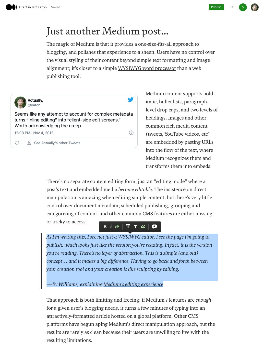
The magic of Medium is that it provides a one-size-fits-all approach to blogging, and polishes that experience to a sheen. Users have no control over the visual styling of their content beyond simple text formatting and image alignment; there is one and only one type of content; customization of presentation is impossible. It’s closer to a simple WYSIWYG word processor than a traditional web publishing tool.
Medium’s editor supports bold, italic, bullet lists, drop caps, and two levels of headings. Images and other common rich media content (tweets, YouTube videos, etc) are embedded by pasting URLs into the flow of the text, where Medium recognizes them and transforms them into embeds.
There’s no separate content editing form, just an “edit mode” where a post’s text and embedded media become malleable. The insistence on direct manipulation is amazing when the content itself, but there’s very little control over document metadata; scheduled publishing, grouping and categorizing of content, and other common CMS features are either missing or tricky to access.
That approach is both limiting and freeing: if Medium’s features are enough for a given user’s blogging needs, it turns a few minutes of typing into an attractively-formatted article hosted on a global platform. Other CMS platforms have worked to ape Medium’s direct manipulation approach, but the results are rarely as clean because their users are unwilling to live with the accompanying limitations.