An @autogram_is client we’re working with at the moment has a complex mix of different systems wrangling its business critical product, part, and customer data. As part of a CMS replatforming project, we’re helping them figure out (for the first time!) how they all work together.
Gathering the underlying information has been an adventure — interviews with many teams across the company’s divisions, forensic data and content inventories, a lot of diagramming.
Normally, we use lightweight diagramming, sometimes even realtime sketching in a tool like Miro, to coordinate with the client and make sure we understand each other. Once things are solidified we polish it up for inclusion in other research & recommendation deliverables.
This project has thwarted that approach, though: the complexity and scope of the systems meant that rough “whiteboard-style” approaches were still too hazy. The different variables — vocabulary, data ownership, differences in process flow from division to division — swamped it.
Stepping back, @karenmcgrane and @beep and I decided to take a different approach. Rather than trying to coordinate around visuals and extract facts about the system, we went the other direction. A “truth table” of statements about the org’s data, systems, and operations.
A giant spreadsheet, in the form of:
<SYSTEM> <VERBS> <DATA> [optionally] to/from <TARGET SYSTEM> with <KEY ID> for <BUSINESS UNIT> in <REGION>
With, of course, accompanying sheets outlining the valid options for each of those blanks.
Quickly, coordinating around this sheet became simpler: the big picture was no clearer, but the company’s teams had never put all of this information in the same place, ever. And the granularity of the “truth statements” made individual entries easier for dev teams to verify.
Now, rather than manually banging out diagrams that capture what we think is true, we’re building a series of data visualizations using @d3js_org that us the source data to make certain problems clearer.
Sankey diagrams to capture where and how key product data comes together to produce “publish-ready” pages — with rich information about what systems own each step in the process.
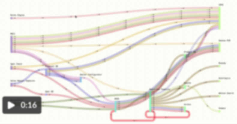
Chord diagrams to visualize the tangly web of inter-dependencies in their systems (which they’d always known were there but hadn’t realized the extent of). Red flags to call out systems that created new product records without checking the central PIM, etc.
The results have been exciting — the source data can iterate as teams iron out edge cases and document little-known corners of the system, and the design/comms work can focus on the best ways to visually communicate the conclusions and recommendations.