I hate big reveals, so I’ll give you the elevator pitch before we get started on this talk. If you’re interested, stick around. Otherwise, enjoy some extra lunch time.
First: Content is a message; structure and process support it.
I’ll try not to get into a big semantic discussion about the difference between data and information and content and all of that stuff, but whether you’re educating and entertaining, or marketing a product, or supporting a service… all content is fundamentally about communicating a message. Things like the choice of content types you create, the data your CMS requires, the way your team approaches adding new things and maintaining old ones, are all about supporting that goal of communicating effectively.
Second, those messages change; some change at different rates. That happens as a business grows, as technical and cultural contexts changes, as audiences tastes and interests and needs evolve. And when they change, the structures and the processes we use to create and manage and distribute them usually have to change to keep up.
That “rate of change” is important, too. If you have an online store, the list of products you offer probably changes more frequently than the kinds of products that you offer, or at least those two things change at different times rather than being perfectly in sync with each other.
Here’s where it gets interesting: Content that straddles multiple layers of change breaks more often.
Most content is complex — it contain a bunch of different smaller messages that need to work together. Or it’s meant to be part of something bigger, contributing its bit to a bigger message. This is important, because when one kind of message (like what’s on sale and why you should care) changes very quickly, but it’s woven into the structure of something that changes slowly (like the company mission statement)… there’s no way to change one without dealing with the other.
Content like that, stuff that combines messages with different rates of change, is more likely to break, and need more work to fix or rework or recreate from scratch.
The payoff I’m working towards here is (I think) simple but pretty important: Content works better when its structures fit those layers of change.
If we study those different rates of change, and use them to inform our decisions about structure and process, we get content that works better. Content that’s easier to adapt to changing needs and contexts. Content that doesn’t have to be torn down and rebuilt as often. Content that’s easier to produce, and more effective, for a longer time.
That’s it. That’s what we’re going to be talking about. You can go stretch your legs now, and if your boss asks what this session was about you can totally tell them. But I hope you’ll be here for the rest, because I think it gets pretty interesting.
With that out of the way, I’m going to tell a horror story. Everybody loves these, right? They’re like content ghost stories — thrills, chills, toasted marshmallows around a campfire, maybe a lesson. Or some laughs, depending on how things play out.
This particular ghost story starts with a big client — billions of dollars in revenue, hundreds of thousands of pieces of content, dozens of different business lines to keep track of, and dozens of different sites to market and support their products and services.
The company had just announced a new brand strategy, and a new marketing plan, and a new design system. They wanted to bring all their different web sites together under one CMS, and it would use their official design pattern library, and it would make life amazing.
Dozens of teams from each business unit spent years recreating their content from the ground up, adapting it to the new patterns and layouts and templates and messaging to get everything into sync. Everybody listening who’s ever been through a big web project project is getting chills. The music from Jaws is playing in the background right now.
Because many years and millions of dollars later, when they finally arrived at their destination? That’s when the company’s design team came back and said, “OK, good news, the next version of our design system is ready, and is way cooler.”
Now, they were no fools, they’d used “structured content” with their new CMS, so they were sure a design refresh would be no problem. Just change the styling! But as they tried to roll out the new… new design, they realized it wasn’t that simple. They’d built an entire content model around the patterns and components in the old design system. No one ever entered any HTML or tweaked any colors, but they had spent three years rebuilding every single piece of content — millions — using structures like “rotator 3” and “hero header large” that came from the design. And those structures were exactly the ones the new design changed.
They gave it a good try, changing just the stylesheets and templates, but all of the subtle differences turned into a game of whack-a-mole. They eventually gave up and accepted that everything they’d worked to migrate — millions of individual pieces of content — would be ‘frozen’ in the old design, and slowly phased as content made with the new and improved design was created to replace it.
To be sure it would never happen again, they launched another multi-year project to plan the perfect customer journey, the ideal messaging architecture, and the most flexible content model, so their IT team could develop the best-engineered CMS, which their communications team could use to create the perfect content.
And that was underway, the company’s marketing strategy changed twice, its business structure was reorganized again, and the IT department changed CMSs entirely. The communications team gave up feeding requirements into the machine and they resigned themselves to banging new pages together with the “good enough” system that was already there. It wasn’t perfect, but at least it existed.
And they were right back where they started, producing content that wasn’t quite right, with content types and metadata that didn’t match their current needs, let alone their future ones, too busy scrambling to keep millions of pages up to date to make much progress towards their perfect future.
What I find really interesting is that nearly every horrible plot twist in that story boils down to a failure to anticipate change — or at the very least, a failure to anticipate the kind of change that would come, and how quickly.
In decades of working in digital publishing, CMS development, and content strategy, the big failures I’ve seen didn’t happen because someone just did their work poorly. They happened because the stuff they made — the stuff entire teams, entire companies made — was good for a season, but too difficult to adapt to the next one, and too expensive to toss and start over.
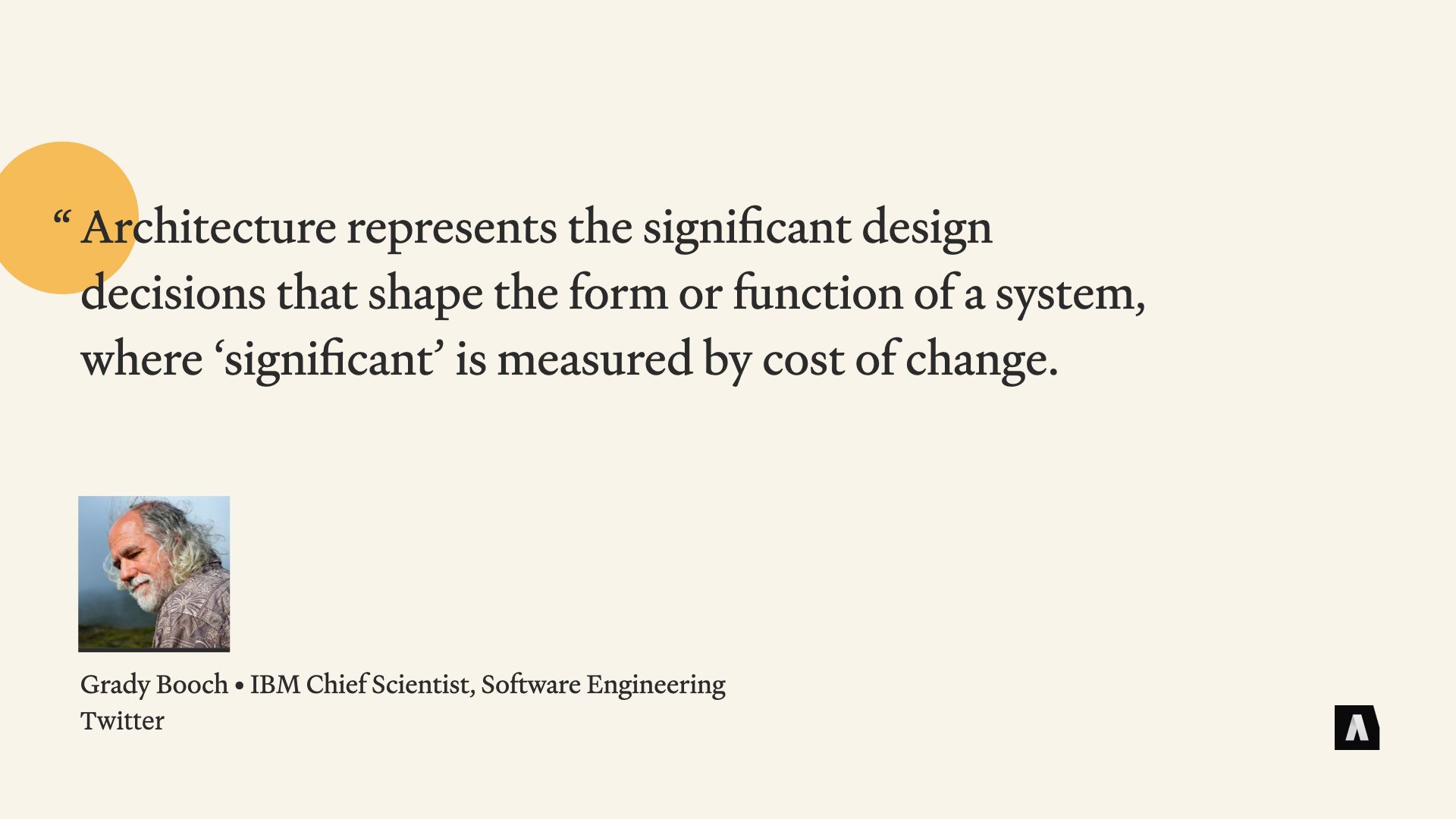
What we’re talking about, really, isn’t just templates or copywriting or setting up a CMS. It’s what some people call content architecture. It’s part structured content, part process and workflow, but can’t be disconnected from the communication goals and business context and the meaty, content-strategy stuff that the tech is supposed to support.
A software engineer named Grady Booch wrote a few years back that “Architecture represents the significant design decisions that shape a system, where ‘significant’ is measured by cost of change.” I love this quote, because Grady clearly understands just how many decisions have to be made over the course of building and maintaining something, whether it’s a set of templates or a piece of software or a marketing campaign or 50,000 words of instructional materials.
He also understands that there’s no such thing as infinite flexibility: If architecture is the sum of all the choices you’ve made along the way that make certain changes easy to adapt to and other changes hard, well… the challenge isn’t making content that will last forever — it’s figuring out what kinds of changes we want to be ready for.
Now… if you’ll indulge me for a minute, I want to zoom out and tell one of my favorite stories. I promise we won’t take too much time, and hopefully it’ll shed some interesting light on the content problems we’ve been talking about.
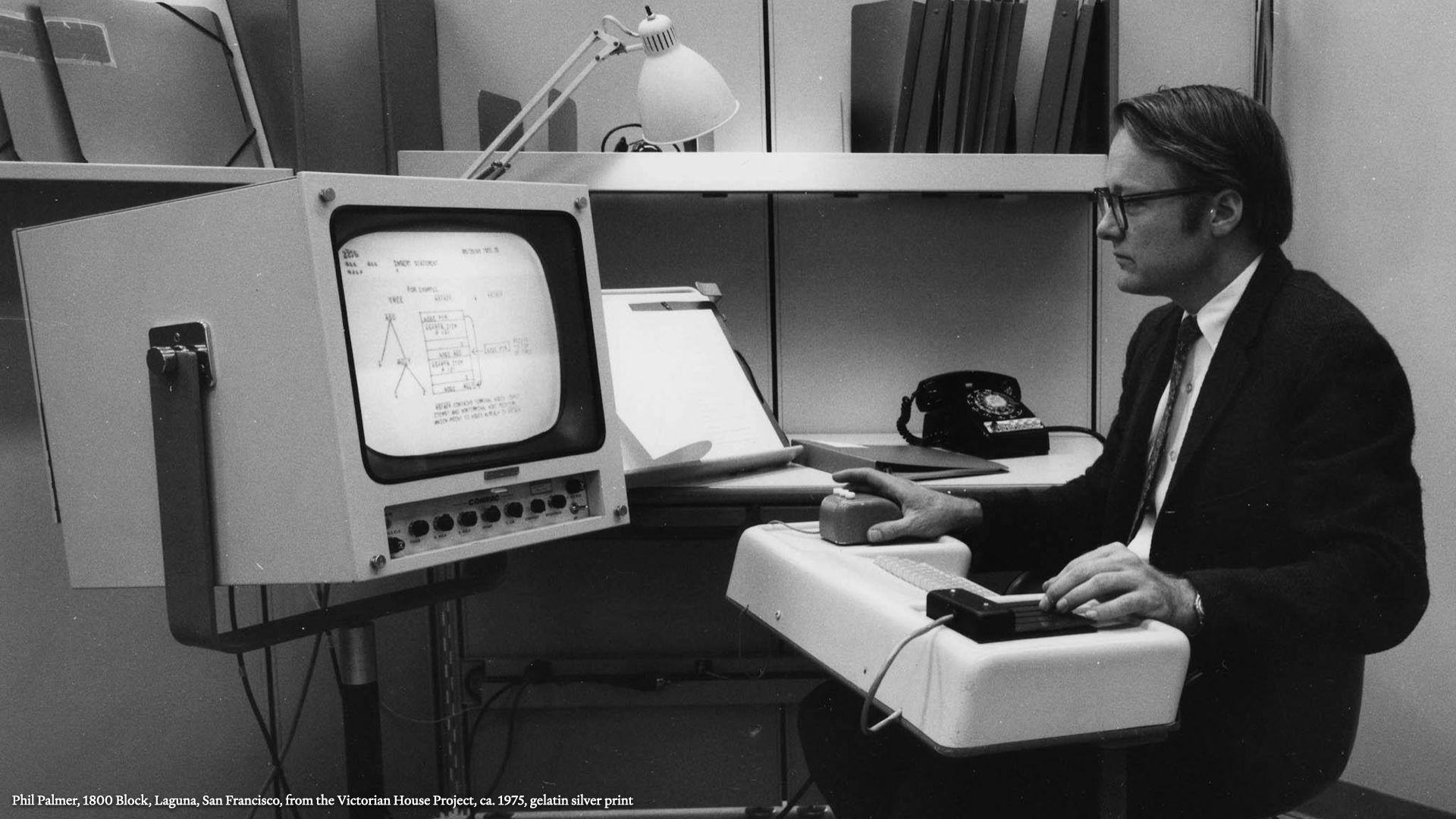
Back in 1968, a computer scientist named Douglas Englebart gave what’s now known as The Mother Of All Demos. It was a 90-minute demonstration of a real, working computer that combined word processing and graphics, revision control, hypertext, a graphical interface with mouse input, video conferencing, even Google Docs style collaborative editing by multiple people over a network.
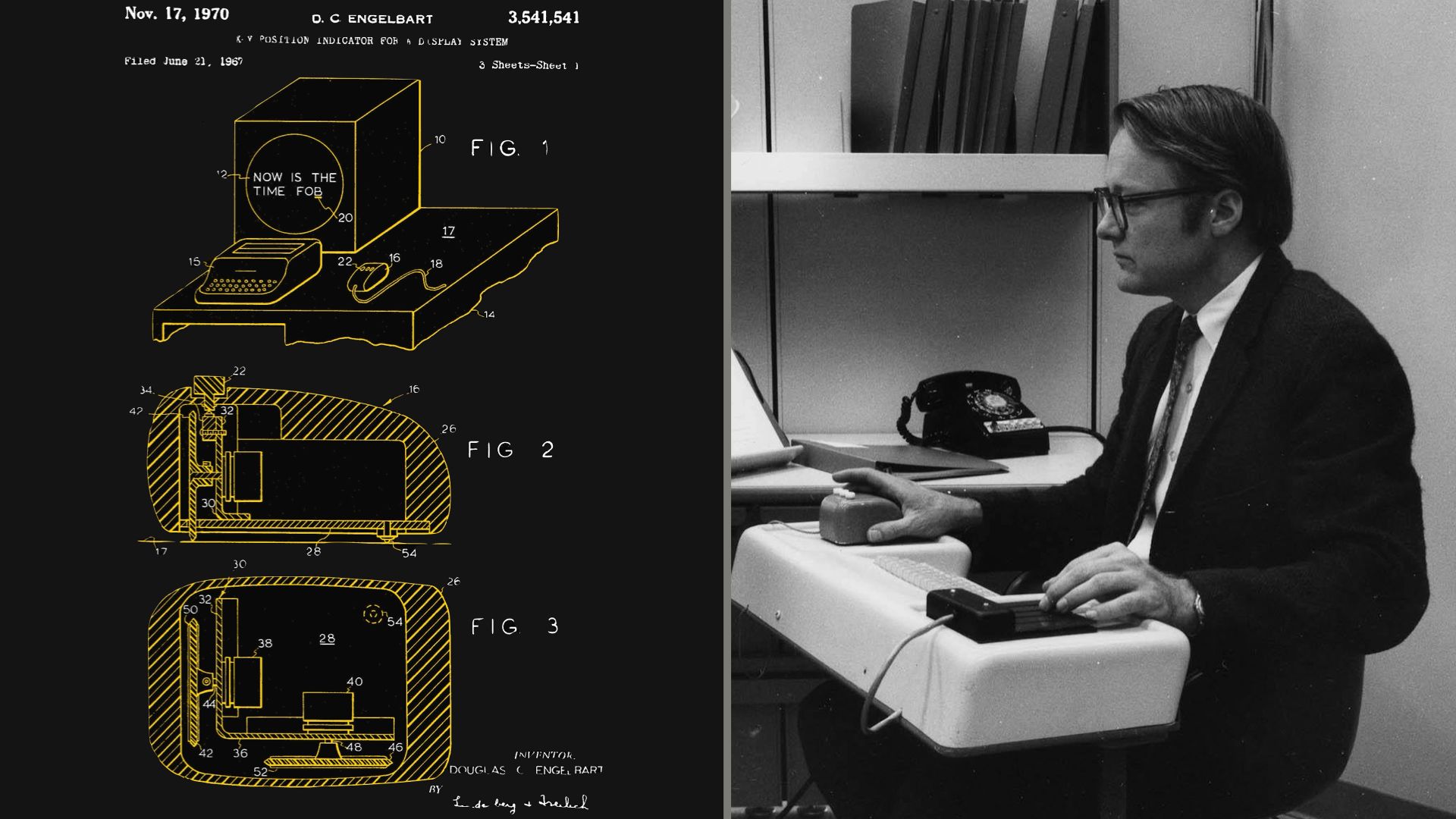
To put things in perspective, Englebart and his team had to design and build a mouse from scratch for that demo, because the mouse hadn’t been invented yet. Steve Jobs was 13 at the time and the co-founders of Google wouldn’t be born for five years. It took the rest of the world about half a century to catch up to what happened in that auditorium.
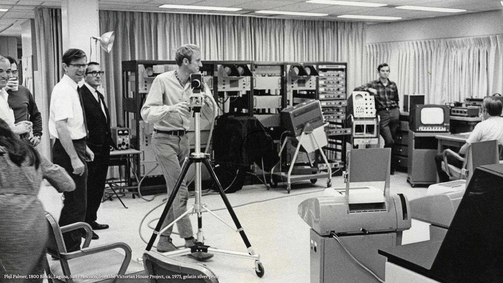
As it turns out, the guy doing who did the video work for that fateful presentation was a thirty year old hippie named Stewart Brand. While the computer industry spent the next fifty years trying to get WYSIWYG working, Stewart chewed on some deeper ideas.
He went on to write and edit The Whole Earth Catalog; founded The WELL, one of the first and longest-lived online communities; and he dedicated decades of his life to a really critical idea: how things change, and how our view of time affects how we engage with the world around us. He went on to call that concept "The Long Now.”

That question of how we deal with time and change as individuals and as cultures is a pretty big one; he’s been exploring it for decades, and one of his books has actually become pretty influential in the Information Architecture and Content Strategy world. It’s called How Buildings Learn: What Happens After They’re Built.
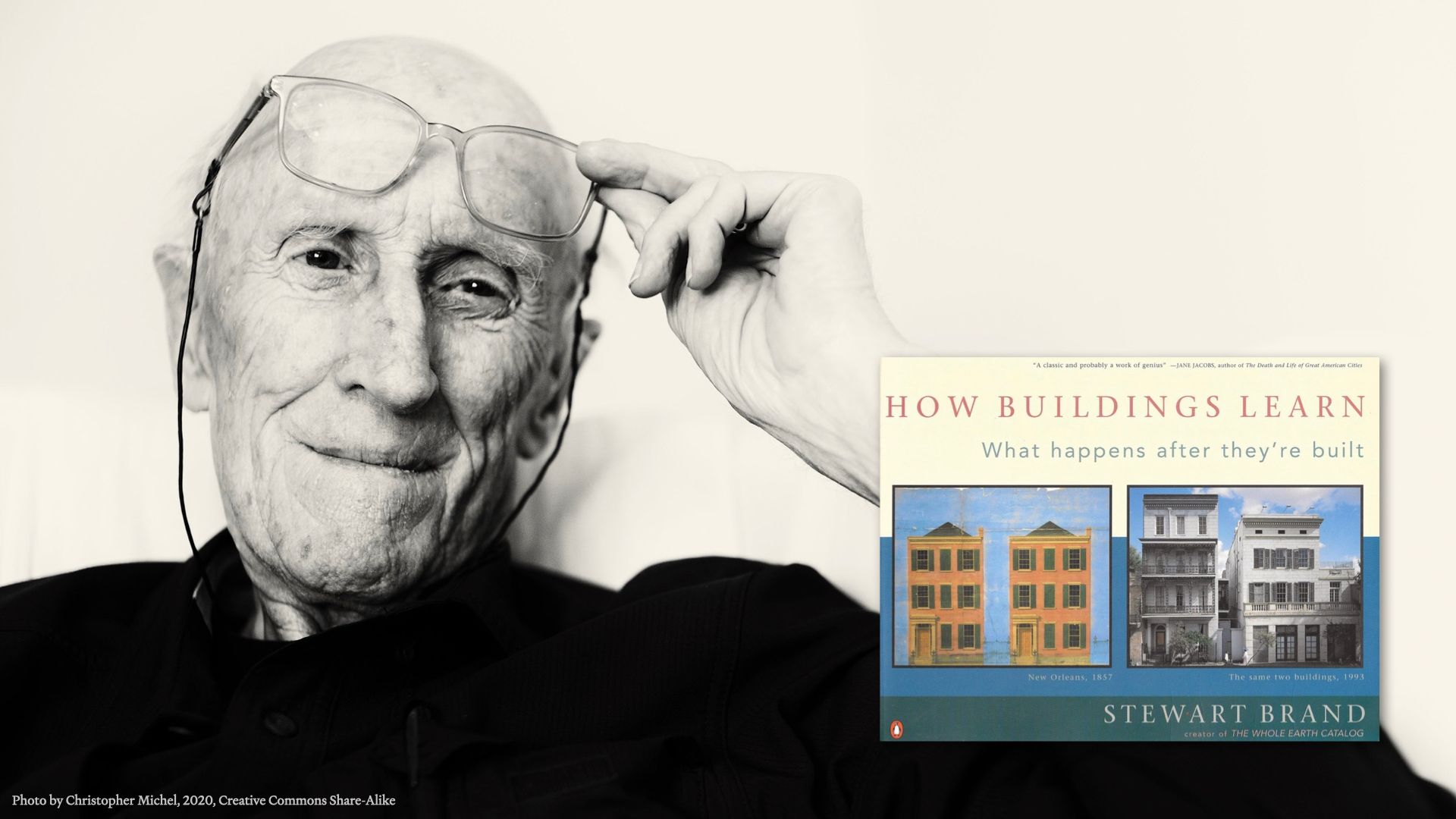
What I think is incredibly valuable is that when he says “learn,” what he means is “change.” And that’s where our story about Stewart and our ghost story about content come together.
See, a lot of the ideas in How Buildings Learn aren’t about buildings as static artifacts; they’re about the people who inhabit them, and change them to meet new needs and reflect trends. That’s the kind of learning that he’s talking about. The ability to adapt and grow, and meet new challenges. The same things I think we need from our content.
With that in mind, let’s take a closer look.
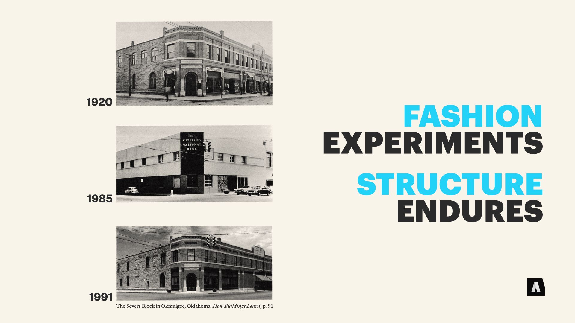
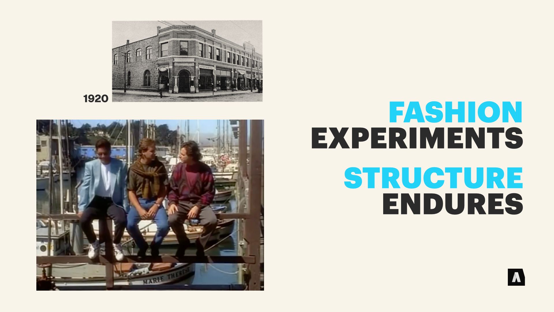
The first principle — and the one I think is probably most familiar to anyone who’s gone through a web site redesign — is that aesthetics ebb and flow with fashion, sometimes even cycling back ground when “retro” looks come back into vogue, but the underlying structure of a building has a much more enduring effect on how the it can be used.
This series of images, from Brand’s book, shows the Citizens National Bank in Oklahoma. Its underlying structure is consistent, but over about a century, it was renovated inside and out — and eventually restored to its “original” brickwork style in the 1990s when towns leaned into the preservation or recreation of historic city centers to compete with malls.
Another great interesting of the fashion-and-structure interplay has been cycling through Netflix for a few years. If you’re of a particular generation you probably have some deeply embedded memories of the opening credits to Full House, including the iconic rows of Victorian homes in the background. The Tanner Family Digs, right there.
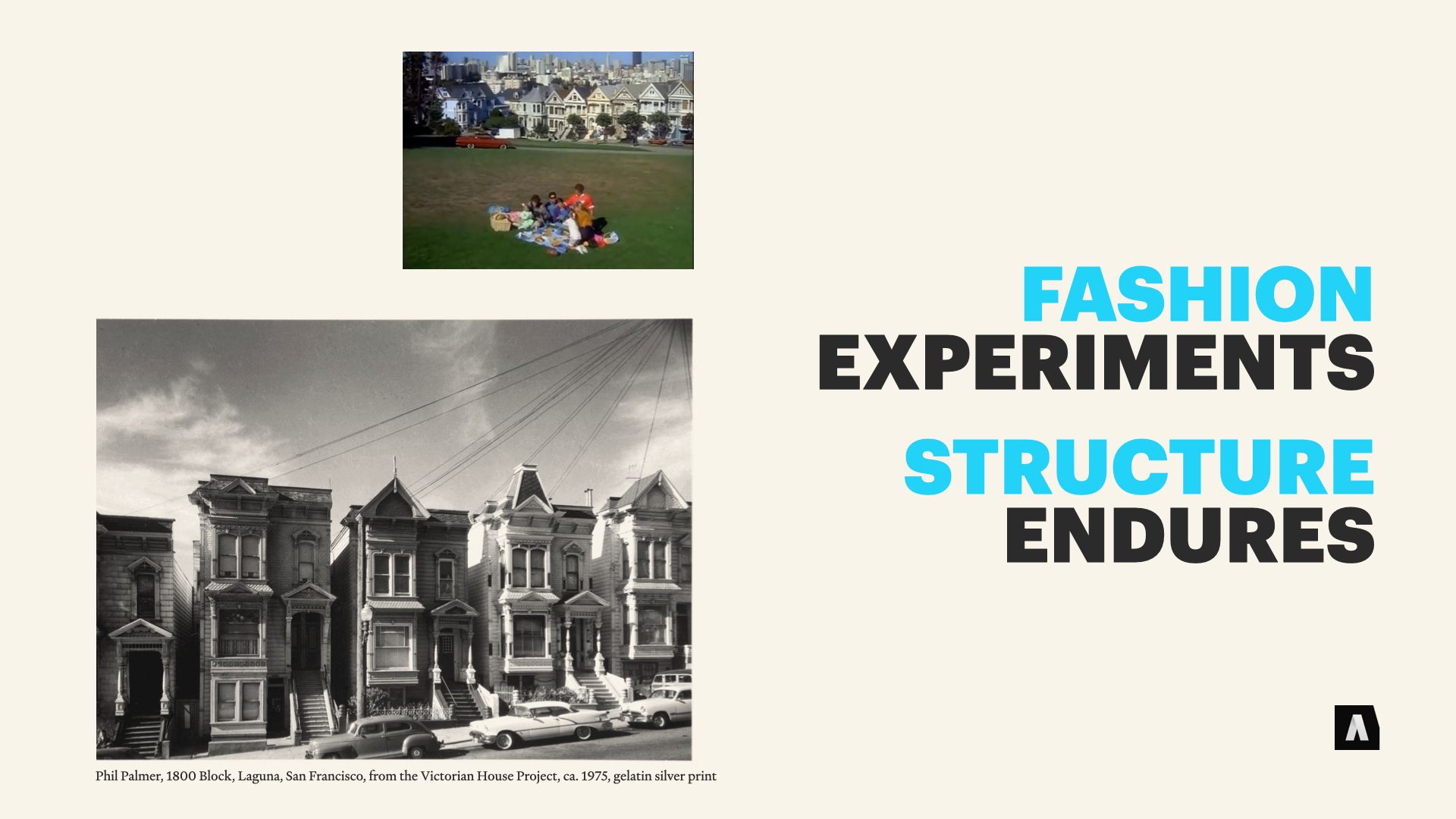
Thing is, around the turn of the century those buildings were extremely passe; Edwardian and Mission style architecture was taking off, and the old buildings with their ornate woodwork were very much out of fashion.
But they proved resilient — because the underlying structure of those Victorian homes was solid and flexible. They were basically three boxes stacked on top of each other, and they could be partitioned into apartments, converted back into single-family homes, turned into offices… you get the idea. The flourishes that made them seem dated could be replaced with modern decorative touches if it really mattered, and the interior could be refitted and refurbished over and over without gutting the structure itself.
The flexibility meant they stuck around — the cost of changing thme to fit new needs was low. They’re an iconic part of San Francisco, now, and they’ll probably continue to evolve even as tastes change.

I think a lot of us are familiar with the idea of the web site redesign forcing expensive changes, but your content “fashion” doesn’t have to be the latest iteration of an aesthetic. It can be the latest social media platform, the latest mobile device, or a “pivot to video.”
One of my favorite examples of sound structure supporting the ongoing evolution of content is The Lark Cookbook, an project by Jared Stoneberg, who now heads Tableau’s content management team. He and his team had to translate a Seattle area chef’s knowledge and experience into a bunch of different media — from print to web to interactive media.
If you’ve ever talked to a content modeling nerd, you know recipes are a favorite example of structured content. But cookbooks are a different matter — they’re notoriously intense exercises in visual design, and adapting them to different forms can be rough.
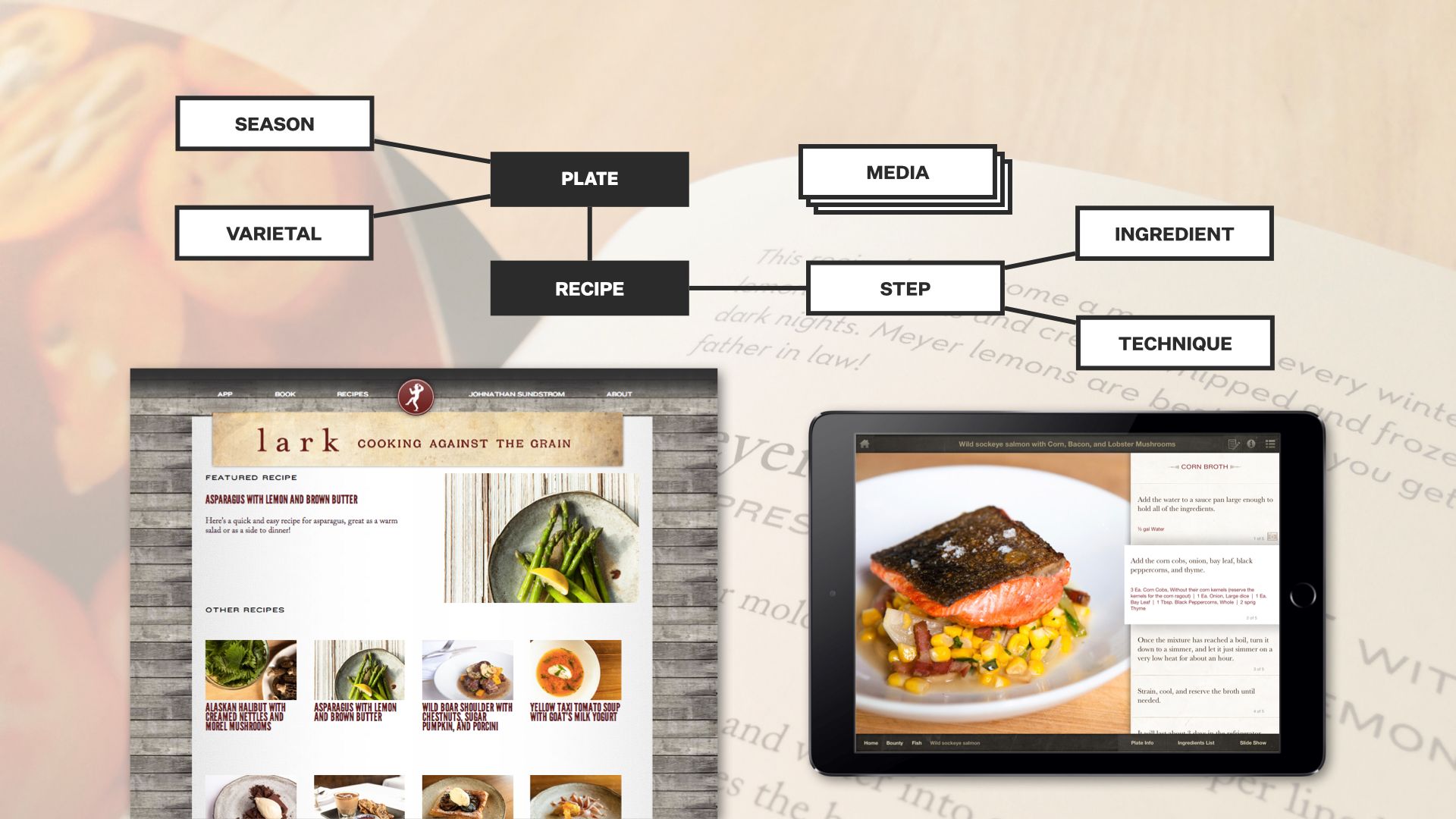
Jared and his team started with the smallest building blocks, and thought carefully about how they connected to each other. One example is the way they thought about educational content mixed through the video. They associated techniques, not videos, with each step of a recipe. Then techniques could have textual, visual, or interactive media hanging off of them, depending on what they had time and resources to produce.
The result made it much easier to change the visual presentation, but it also made adapting it to very different forms — print, ebook, web, interactive tutorials — possible without recreating the underlying content. A different structure might have made one or another of those destinations easier to produce… it wouldn’t have enabled the kind of remixing, the evolution, that this one did.
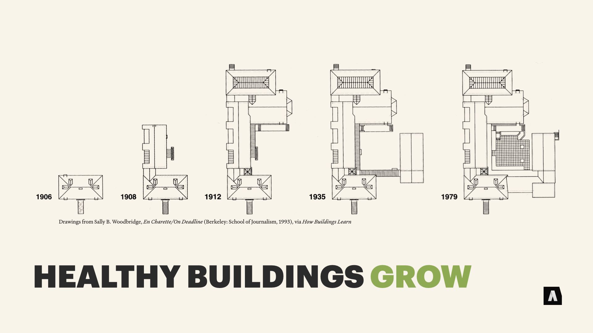
We tend to think of buildings as static, but quite a few big buildings start small. Homes, factories, even skyscrapers accumulate additions and significant structural modifications as families and businesses and cities expand.
Some architectural choices makes those expansions relatively painless — you knock out a wall and you build a new room, for example, rather than tearing out whole rooms or major structures.
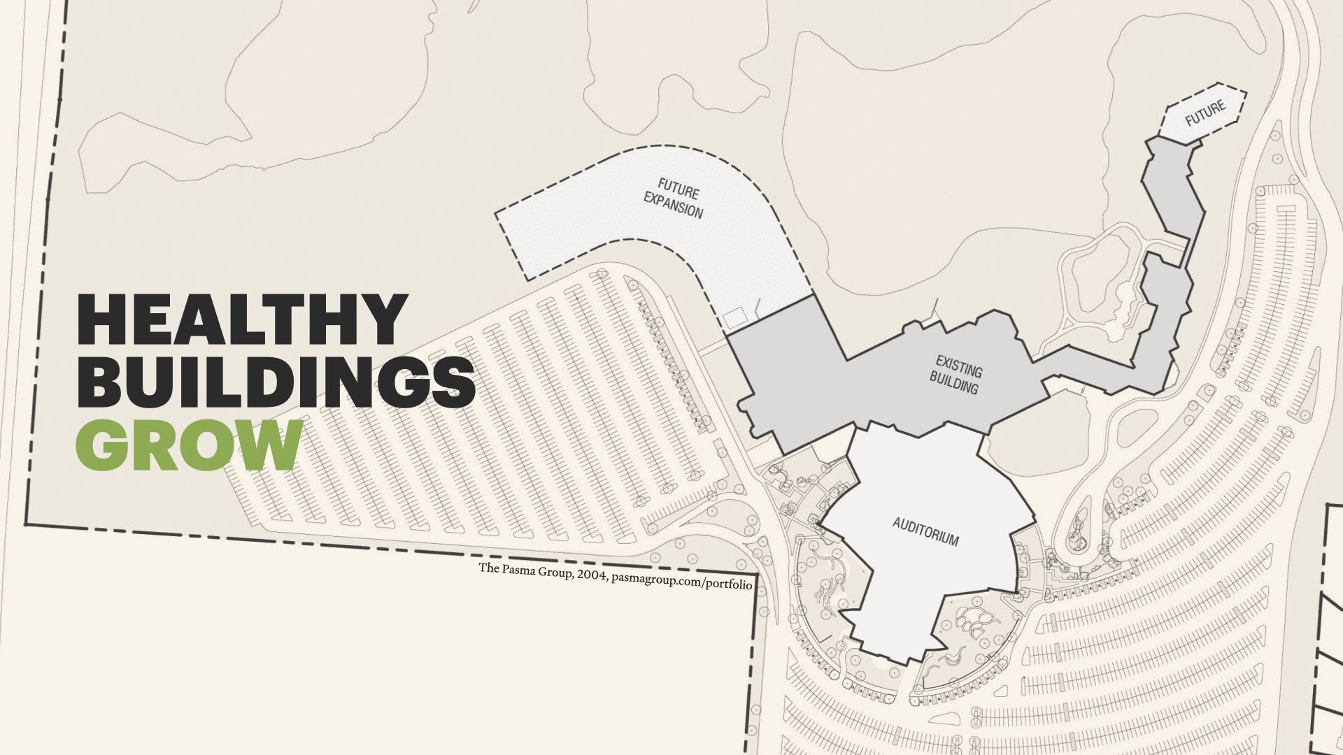
Sometimes that flexibility is part of an explicit phased plan — like, “We’ll build the central room, then next year add on the den…” Willow Creek Community Church in South Barrington, IL is sort of the Death Star of mega-churches, and in the early 80s, they planned on massive growth. The architects they worked with designed an initial church, auditorium, and all that jazz; but they also built in expansion points — walls and structures that could be torn out to facilitate the next wave of growth, and the one after that, and the one after that… without disrupting the rest of the structure.
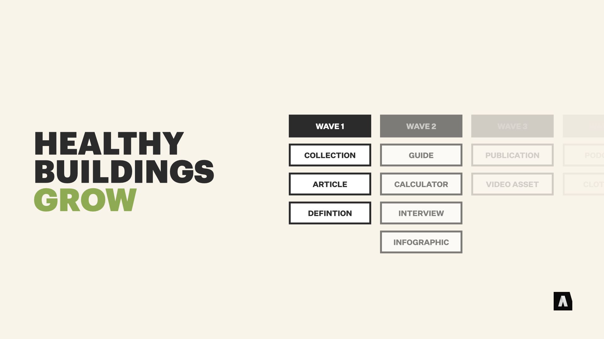
At Autogram, we’re actually working with a client right now — helping them plan a multi-year, phased rollout of a bunch of educational materials for their customers. They’ve got a grand vision, but they know it’s too much to bite off all at once. So we’re doing detailed plans for “wave 1” of their content, and rough sketches of subsequent waves — to ensure that the Information architecture, editorial, and content modeling decisions we make in the early phases don’t paint us into a corner.
That’s different than “making a perfect content model that will never have to change” — it’s looking at the specific things we believe are coming, and making decisions that will support the future work.
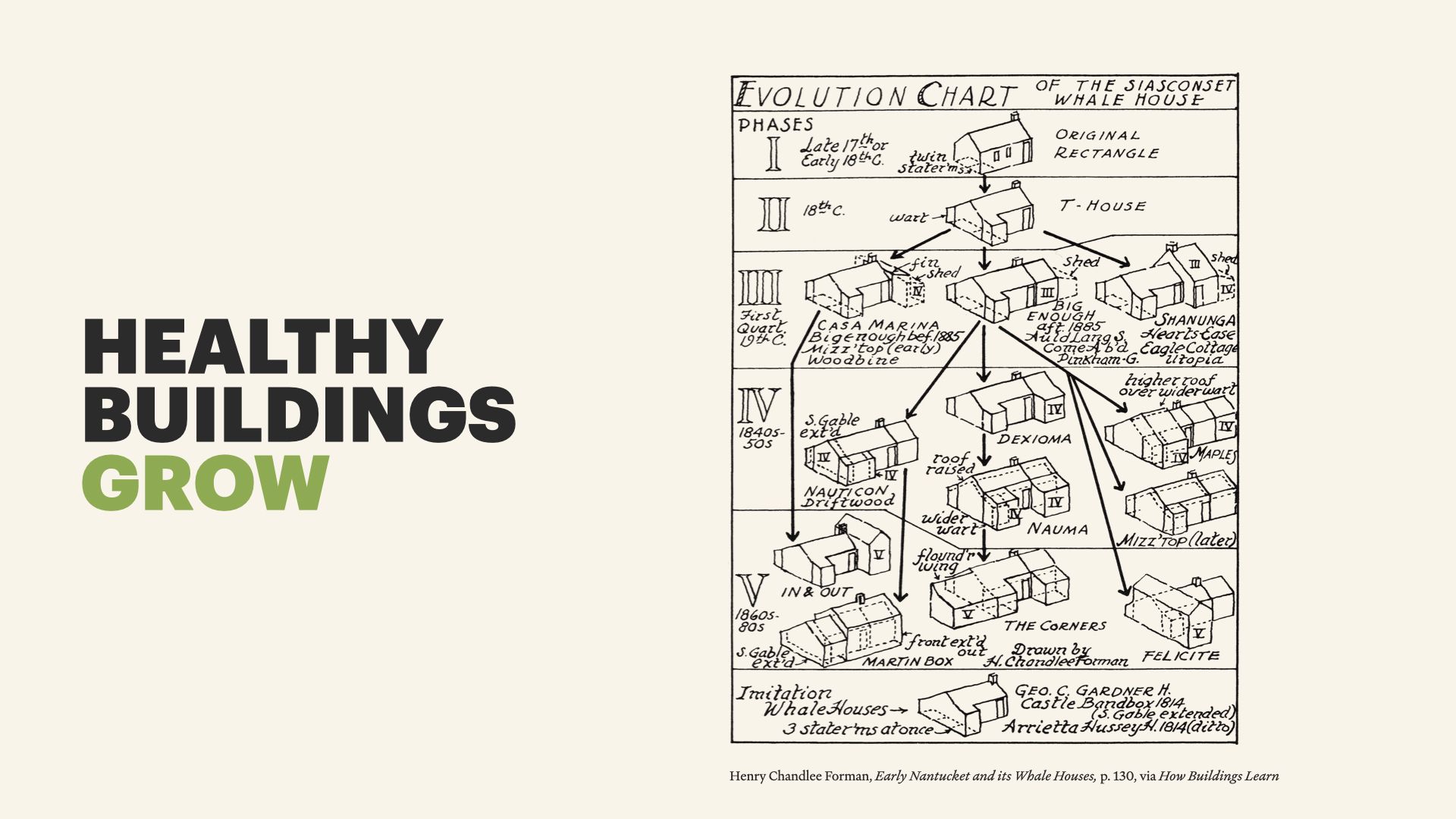
Now… growth doesn’t always work that way. Architecturally, some of the most successful kinds of buildings — styles of construction that come to dominate a particular region or time period — become successful because they’re just inherently easy to modify and expand. In his book, Brand talks about the example of Whale Houses in Nantucket. Most of them started as boxes and accumulated additions over time, with builders sharing tips and advice about what kinds of expansions worked best and left the most flexibility for future needs.
Obviously the idea of “growth” works a little differently in the world of content. When your digital publishing operations ramp up, you don’t run out of physical space, but you can run out of resources — swamping your existing content team, or burning through your budget for third-party translation. Your existing information architecture — your systems of organizing and presenting content to people — can break down under load. And having a gameplan before the crisis hits can help.
I always used to argue with Karen McGrane that the best way to plan content was carefully speccing out every single permutation of every kind of message that might be needed, because only with semantic precision could you have a good content model. The “we’ll construct a giant building from scratch on day one, and hope we grow into it” approach. Over the course of a bunch of different projects she’s convinced me that path can be really brittle.
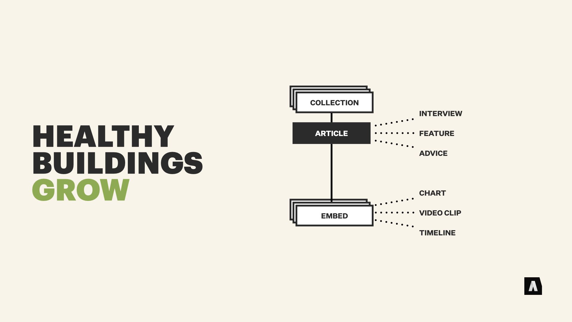
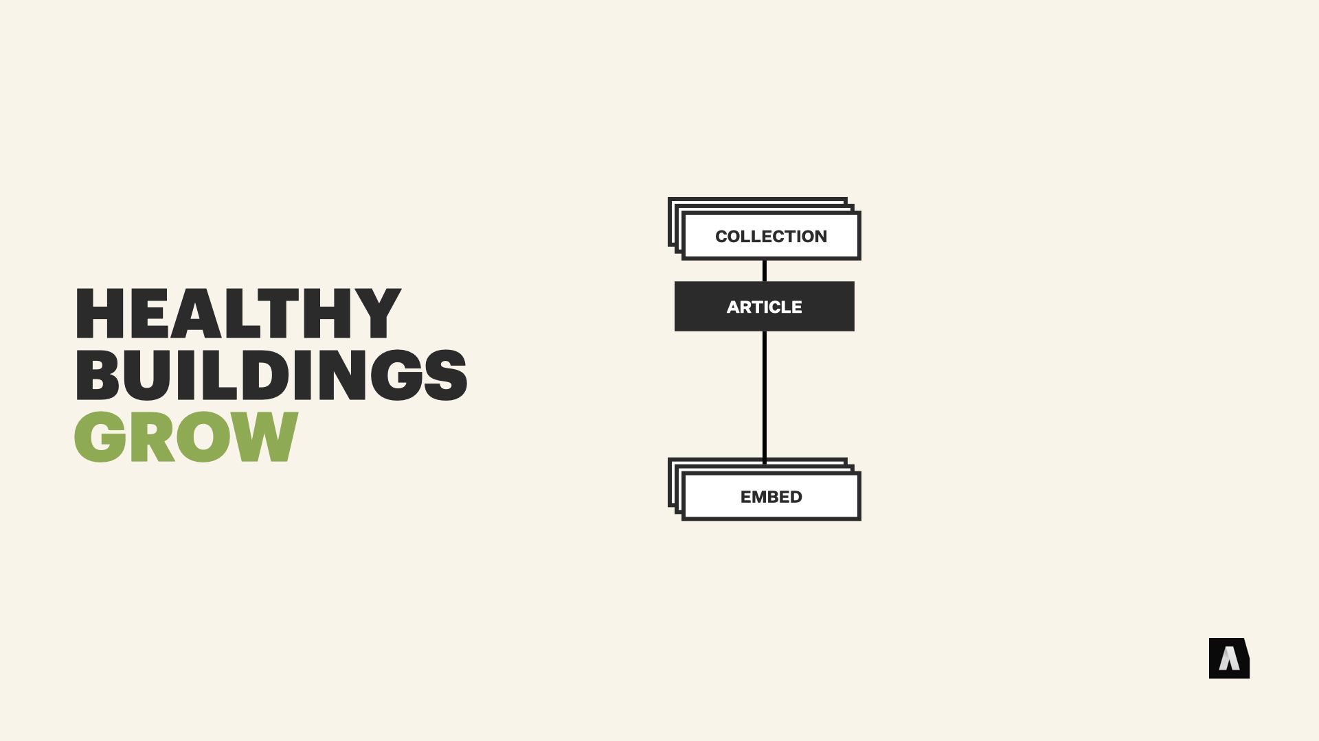
An alternative strategy that can bring a lot more flexibility is catch-all content types with small “pockets” of structure embedded inside of them. Like an article content type, and separate “chart” and “video clip” and “timeline” content that can be created and stuck inside of an article.
The idea is that new kind of messaging, new content trends, new creative ideas — can be added to the list of “embeds” without totally re-architecting your article content type, or breaking old content that uses last year’s embeddable stuff. It gives you a path to grow without breaking old stuff.
And if specific new patterns emerge — like, “Interview articles always start with a photo gallery, and include two video clips” — you can build out specialized content types to capture the stuff you know is working.
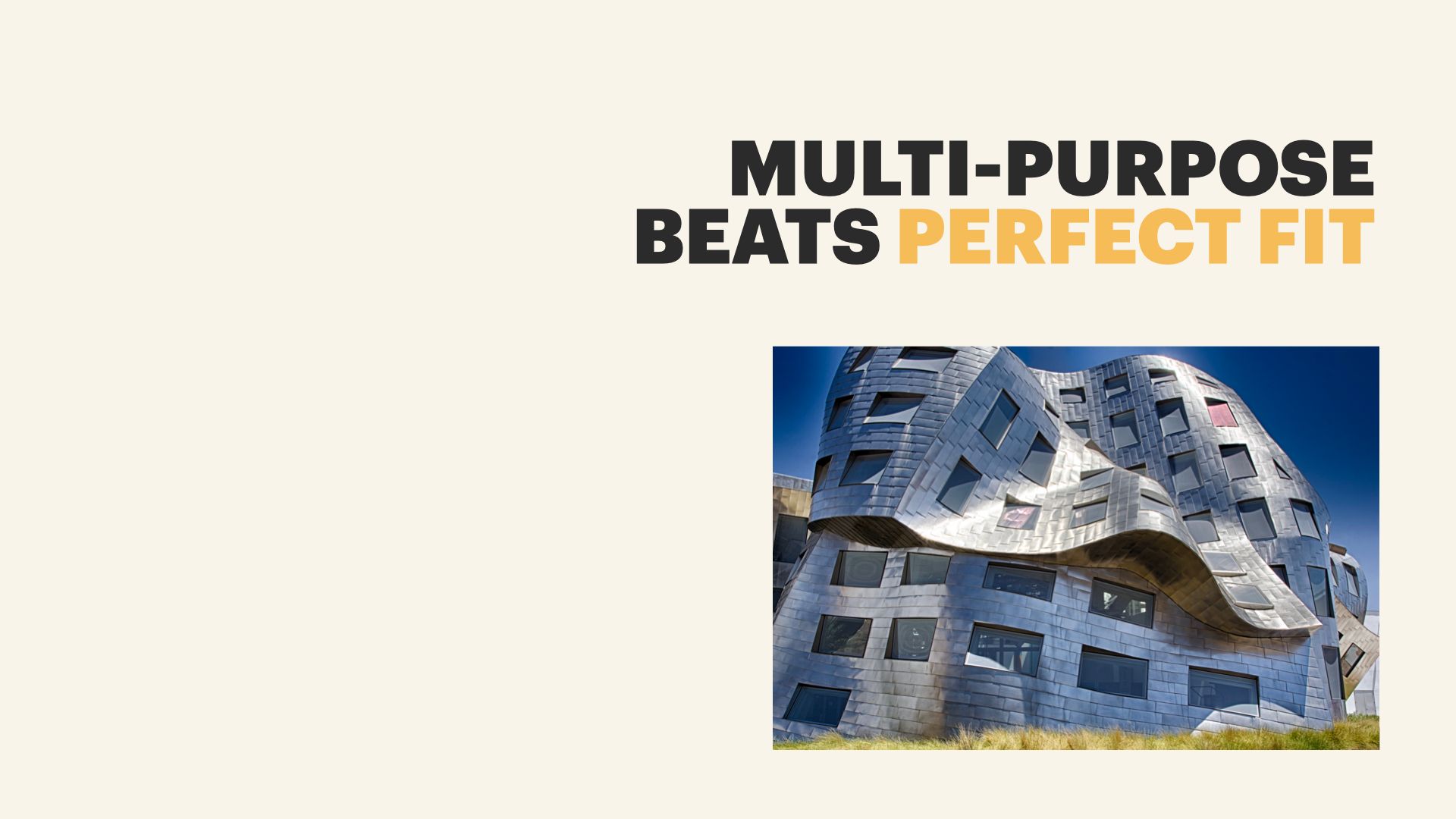
That brings us to the next principle. When needs are unclear — or changing rapidly — multi-purpose buildings that that are flexible and “good enough” beat highly specialized purpose-built structures. In How Buildings Learn, Brand connects this to the idea of “satisficing” — a combination of “satisfying” and “sufficing.”
That funky-looking building is the Lou Ruvo Center — it’s “Art” architecture, and it’s impressive and beautiful and it can take your breath away when you stand next to it. But it isn’t great, as Brand puts it, at learning. A structure like this is tremendously expensive to change if the needs of the people who use it change.
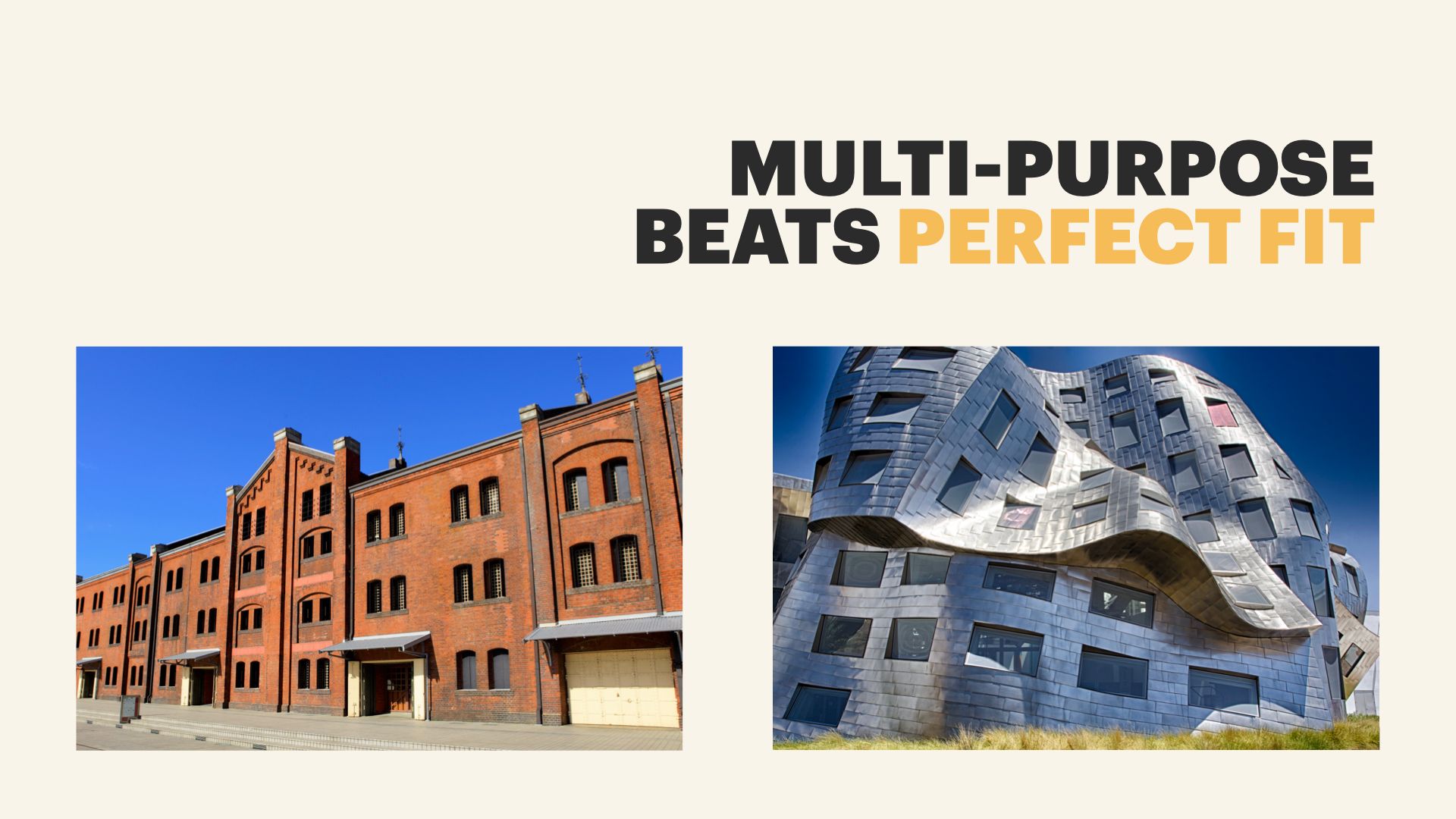
The anonymous red brick warehouse on the left, though… By Stewart Brand’s reckoning, that’s a building with a rich future. Because it has an open floor plan, an extremely solid structure, and its plumbing and electrical are all exposed — it can be renovated easily, and repurposed in loads of different ways.
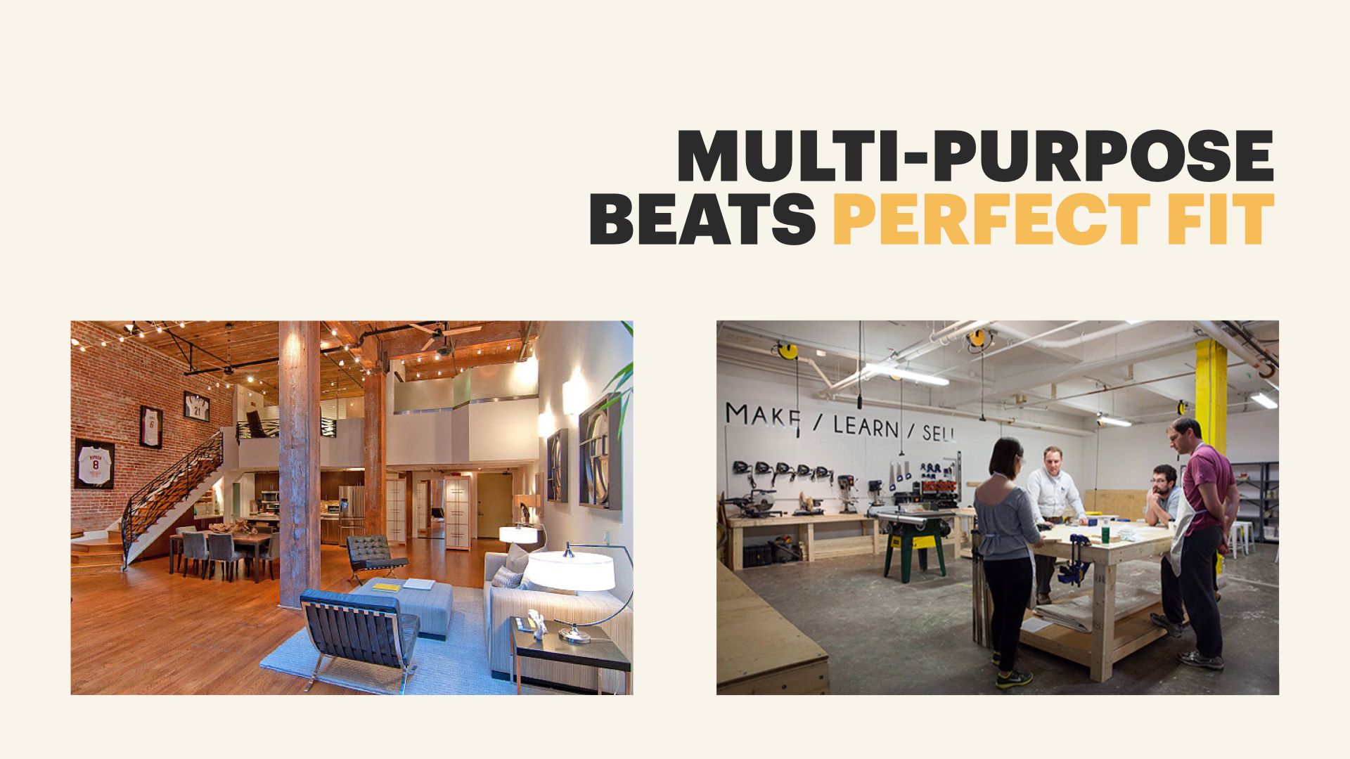
The idea of a “warehouse loft apartment” is an aesthetic that’s tied to the underlying open-ness and flexibility of that structure. But the same building can just as easily be turned into, say, a local makerspace filled with woodworking equipment and 3D printers. Or an office. Or… a warehouse.
In How Buildings Learn, Brand even gives some credit for the rise of Silicon Valley to the ubiquity of old WWII era factories and warehouses littering the West Coast. It gave companies easy access to extremely flexible, extremely durable spaces that could be easily modified as the companies experimented with new projects and new ideas.
Now, spaces like that take work to modify, but the lack of inherent assumptions makes that customization possible. They’re built for flexibility. And if you knows, beyond a shadow of a doubt, that you have specific needs, designing and building something to meet those specifications (like underground generators to handle power failures) can be a good idea. But, again, if those needs change? Or if you’re not certain what you’re going to need in a year? Or if you’ll only be there for a year and another company will move in after you? Multi-purpose is hard to beat.
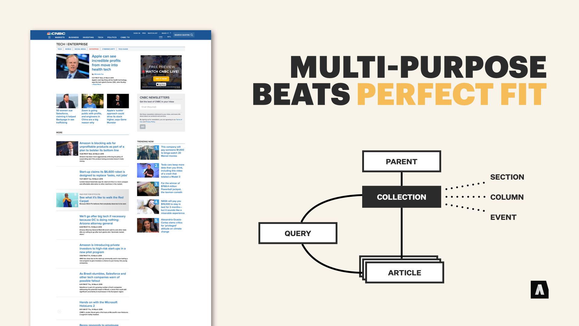
Years back I had the pleasure of working with the CMS and digital publishing team from CNBC. They’d built an extremely flexible system for organizing their content around the idea that new sections of the site, or new ways of organizing things, should be something editors have the power to create and iterate on as needed, without bringing in the IT department.
So their navigation and their site structures were all driven by a content type called “Collection.” Editors could put articles into collections, they could put other collections into collections, they could set up dynamic rules for what things should appear in a collection. And they could do things like add custom color schemes and make some basic prioritization choices.
The result was that “Special event” coverage, like a cluster of stories focusing on an unfolding scandal… or recurring column by a particular author… or a topical section of the CNBC site… could be assembled on the fly and closed up when they were no longer relevant. The editors loved it — they could experiment, find out what worked best, and share those patterns without expensive cycles of CMS development.
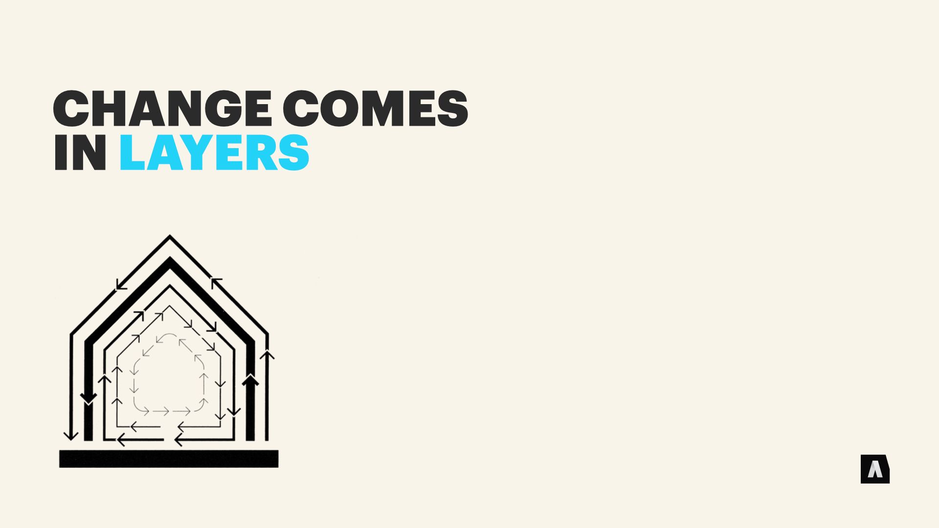
The last big idea we’re going to look at is one I teased earlier in the talk — it’s the idea that change forms layers. We’re talking about it last, but it’s integral in Stewart’s book. He picked up the idea from Frank Duffy, an architect who wrote about the idea in the early 90s.
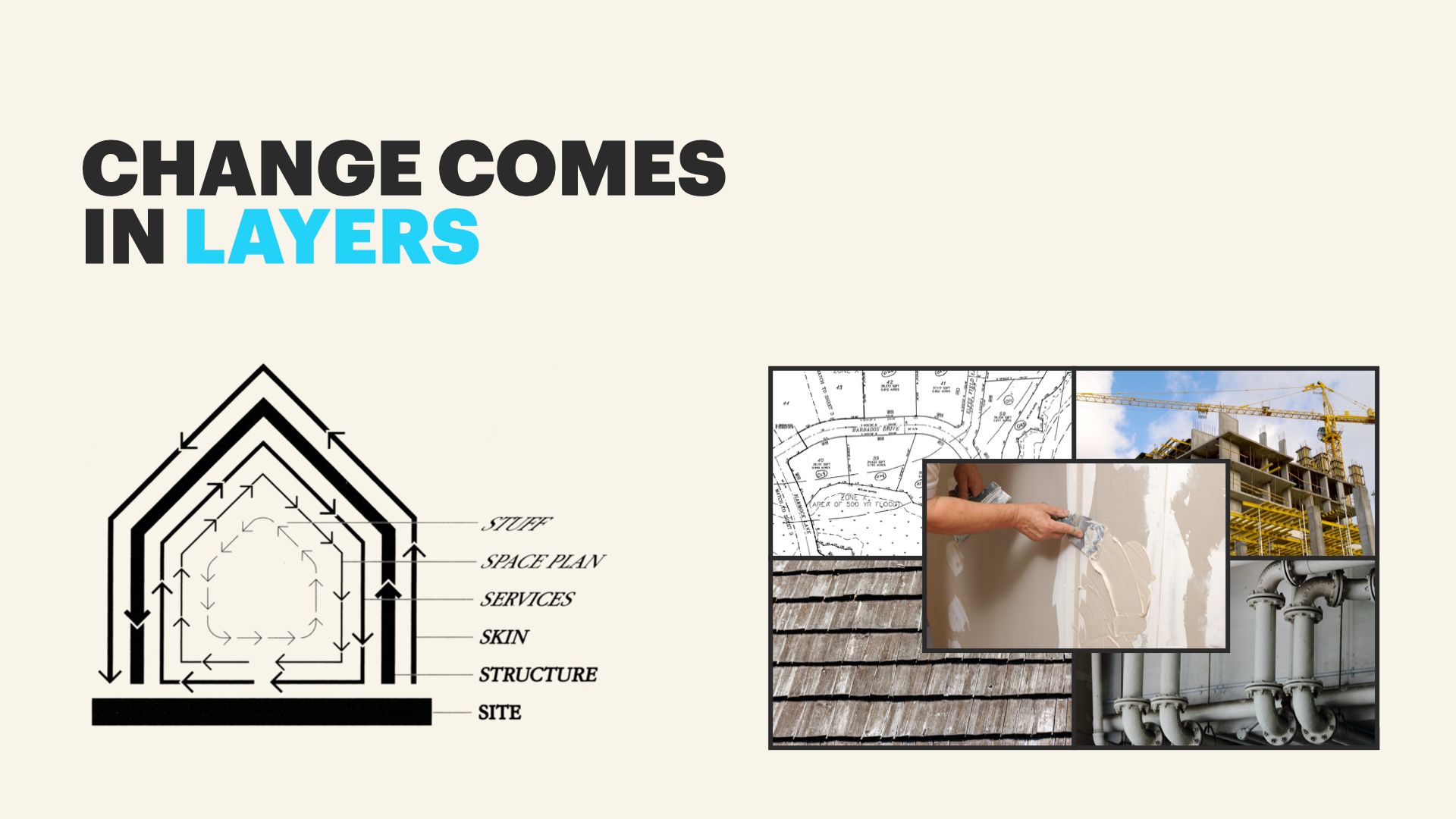
Duffy talked about the fact that different parts of a building were always changing, and that they had different but overlapping cycles.
The underlying site of a home, with its legally defined lot and its geographical location, might be possible to change but most stay consistent for generations.
The structure of the house itself with its foundation and frame and load bearing elements is tremendously expensive to alter once the building is constructed, so it’s often untouched unless it has to expand or something goes terribly wrong.
The skin — exterior elements like siding and windows and roofing — often change every couple of decades, as fashion moves on or new technology like improved weatherproofing makes the cost a net positive.
Duffy’s model also included the “services” that are part of a building. The plumbing, the HVAC system, the moving parts like elevators and electrical systems. These often wear out or need big refits every 10-15 years.
At a more everyday scale, there’s the space plan — interior walls and ceilings that can be altered as usage needs change. In a stable home they might stay the same for 30 years; in a busy office building they might be altered every couple of years as business move in and out or layouts are reorganized.
And finally, well, there’s all the stuff. Your chair, your desk, your bookshelf and your books and your toothbrush. From the perspective of a building, it’s constantly in motion, shifting around monthly, weekly, and daily as you do your things.
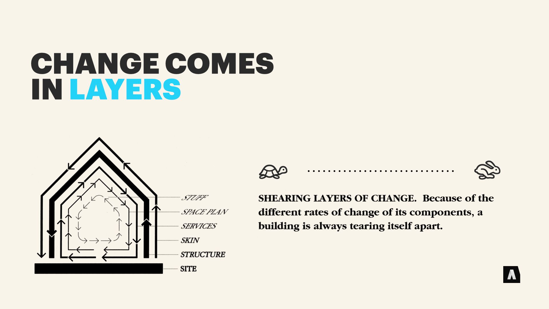
Duffy called them Shearing Layers. Because they’re all in contact with each other, they have to coexist, but they’re changing at different rates they can tear at each other if they’re too tightly coupled.
If the space plan of a building is too restrictive, you might need expensive remodeling before you can move a new desk and bookshelf into a home office.
If the electrical services of a building are too deeply embedded in the structure — too hard to access or too expensive to update — a commercial buildings might have to be gutted and rebuilt when its infrastructure gets outdated — even though the structure is sound.
Back at the beginning, when we talked about “architecture” being the accumulation of choices that are expensive to change? Well. This is where it all comes full circle.
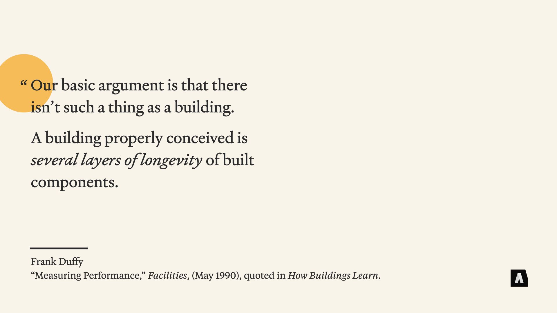
In a 1990 article, Duffy said that “There isn’t such a thing as a building. A building properly conceived is several layers of longevity of built components.” It’s a bold statement, but he’d fit in well with people who like to argue about the difference between a messages and content and data.
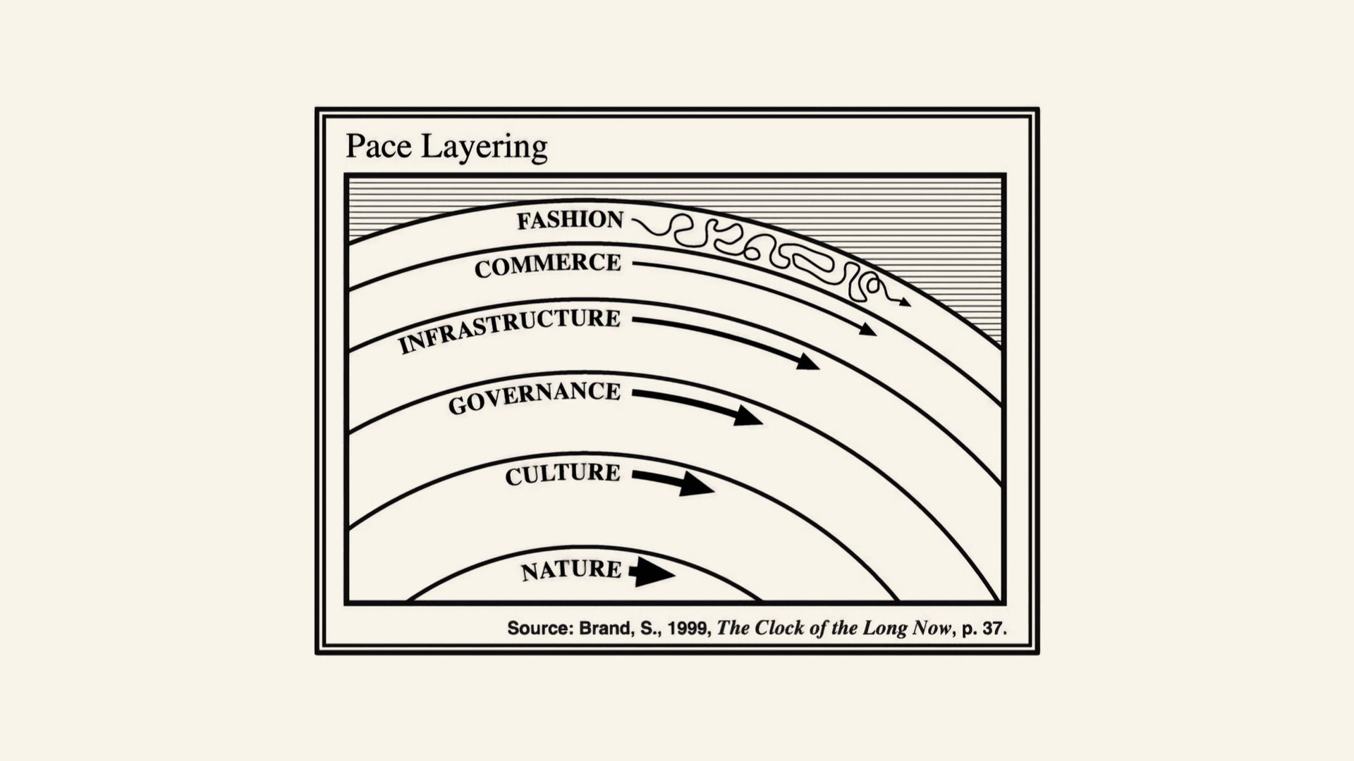
Now, Stewart Brand found this concept of layered change and the tension between those layers so fundamental that he stepped back a few paces and started applying it beyond the realm of architecture. In his following book, The Clock Of The Long Now, he applied it to the way civilizations work. He called it “pace layering,” and that term has actually been adopted in a number of different industries to talk about how different parts of systems interact with each other over time.
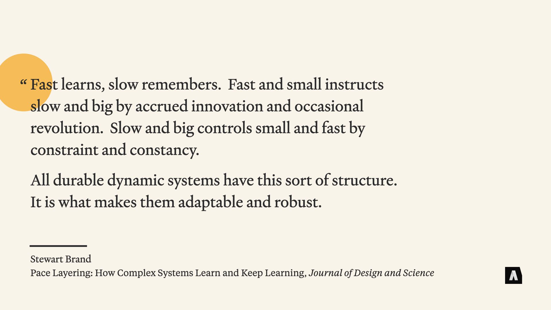
It’s important to note that Brand wasn’t devaluing the fast-moving stuff like fashion and commerce in favor of conservation. He just wanted to learn more about how they worked together. In an article a couple of years ago in the Journal of Design and Science, he wrote:
“Fast learns, slow remembers. Fast and small instructs slow and big by accrued innovation and occasional revolution. Slow and big controls small and fast by constraint and constancy.
All durable dynamic systems have this sort of structure. It’s what makes them adaptable and robust.”
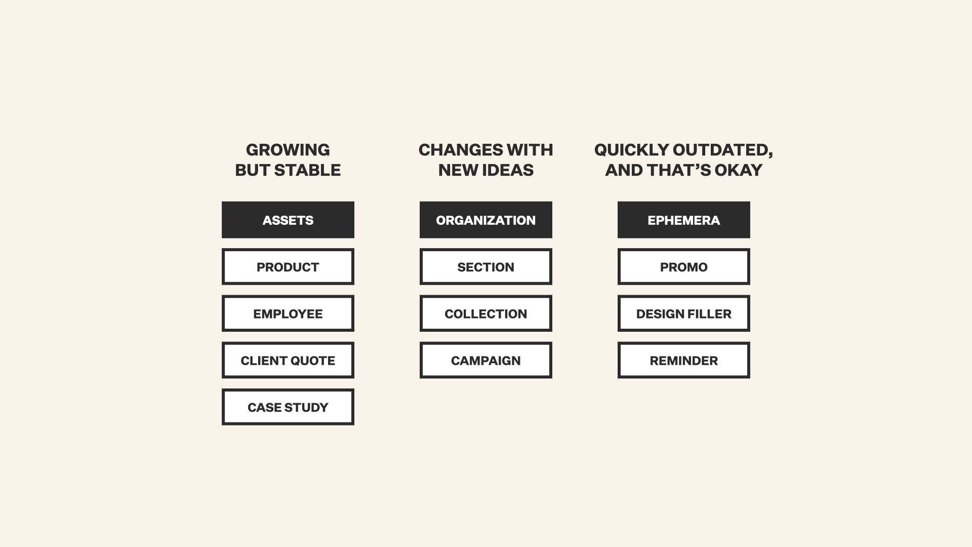
About a decade or so ago, colleagues from Lullabot and I started thinking about how those ideas could improve the content models we made for clients — particularly ones that were frustrated by all the structural changes that had to happen to implement — from their perspective — seemingly minor design changes.
Rather than just breaking things down by types of pages, we looked at how often things changed. We called stable, consistent things tied to the fundamental business of the client “Assets.” Content that was really just used to organize things and make it easier to navigate changed more frequently — a lot like the “Space Plan” in a building. And the fast moving disposable stuff — promo content for an upcoming webinar, content that was closely tied to the new design and would be thrown away if it ever changed — we called “ephemera.”
That breakdown allowed us to prioritize — we could think carefully about how we designed Assets, because we knew they’d be around for a long time. But as long as Ephemera worked in the short term, we didn’t have to sweat the details — because it would probably be changing next month anyways.
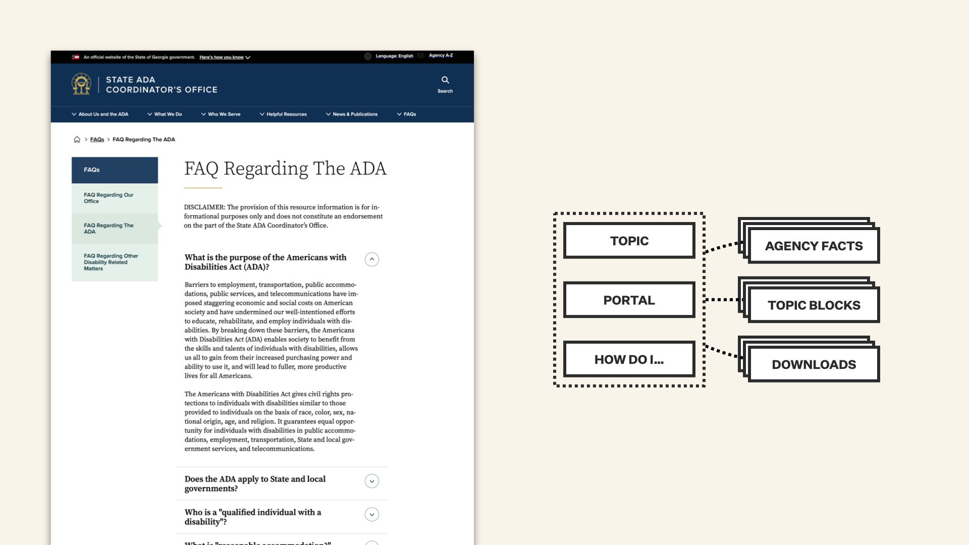
That way of looking at things was a huge help on a recent project with the State of Georgia, too. They had dozens of agencies with different missions and a CMS that had to serve all of them with a finite, manageable set of content types.
One of the big problems they had was that information on those various sites fell out of sync fast. The phone number for one office would get added to an article on another agency’s site, and never get updated when the extension changed. They had the same problem with PDF forms, and explanations of regulations written by one department but copied and pasted to another’s site… you get the idea.
After a lot of work with them, we were able to cluster their content into a couple of meaningful “pace layers.” organizational and explanatory stuff written for one site — and likely to stay there. They also had fundamental facts, like what agency is responsible for what program, and what phone number to call and what street address to go to if you need to visit in person. That stuff was actually more like “data” than “content” — they got a little tool to insert it into other articles, like tokens, so the CMS could keep everyone’s pages in sync if a number or an address changed.
Things like “summaries of an agency’s responsibilities” or “who qualifies for a program” or “the latest version of the hunting license application” became microcontent that could be dropped into other pages, but auto-updated when the original agency updated its content.
The end result is that their content doesn’t rot as quickly — because the stuff they’re writing is insulated, with that system of embeds and tokens, from changes to information that moves at a different pace.
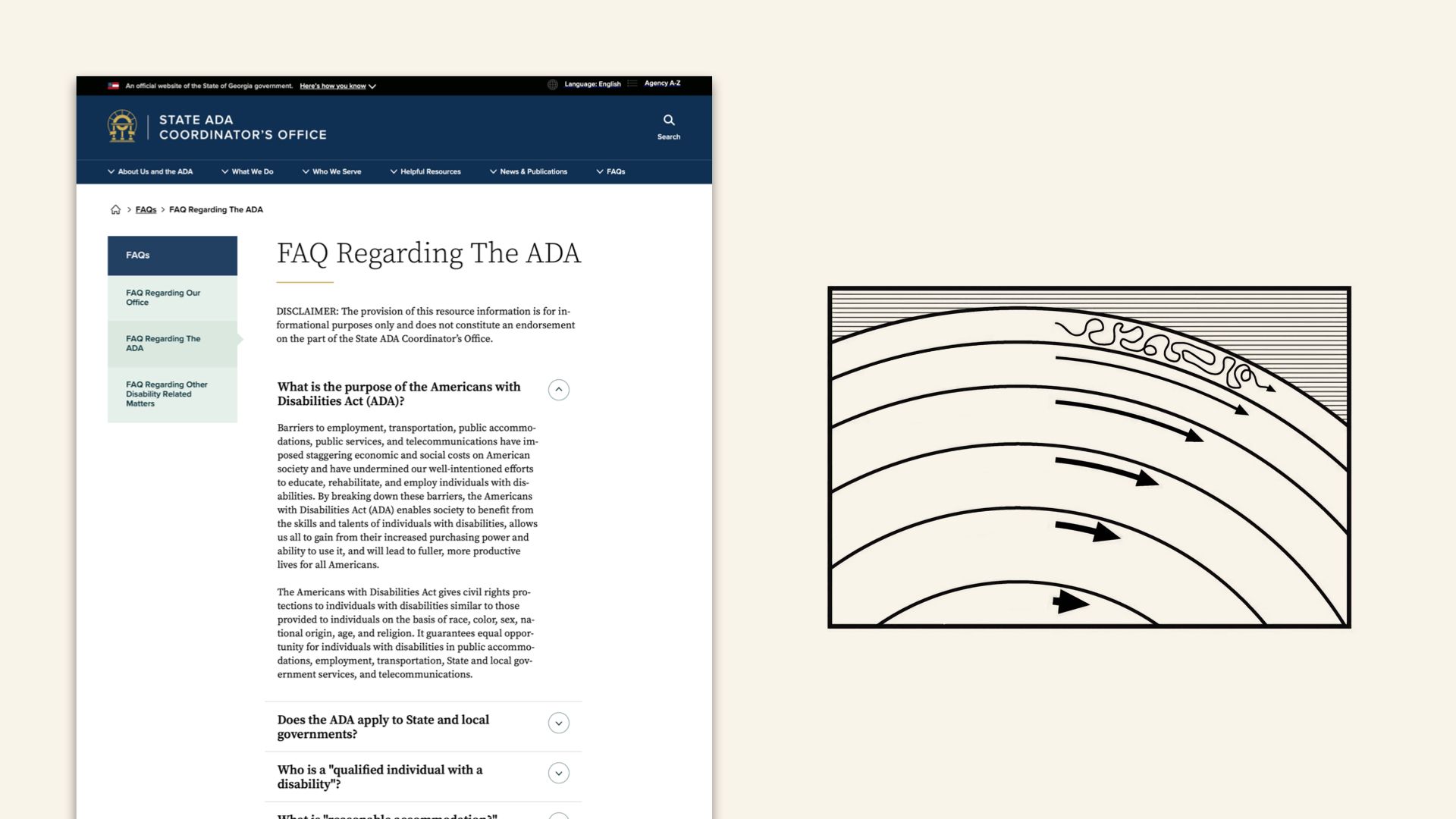
I really love that story, in part because it didn’t break down the information based on visual design patterns or an arbitrary idea of “what’s the most semantically correct way to describe a government program.” It looked at where the friction was between different layers of continual change, and teased them apart just enough that they could work together without breaking each other.
That, to me, is a pretty big payoff. And it’s not a single magical content model that everyone else can adopt, because the nature of those pace layers and the places where they rub against each other differs from organization to organization, from message to message. Often, it’s closely connected to what makes your organization special.
So. Whew.
After all that big idea stuff… I want to bring things back around and talk about concrete things we can do right away — ways we can apply that “time-and-change” view of the world to improve how we structure our content and how we work with it.
The first and easiest option is to conduct what I call a “change inventory.” It doesn’t have to be complicated, and in a lot of ways it’s like a high-level content inventory. You look at your content and you ask some questions about how it’s changed in the past, and what you expect in the future. That process can give you some interesting early insights that hint at something like pace layers. They can also help you identify hot spots, like content you have tons of that also requires frequent updating.
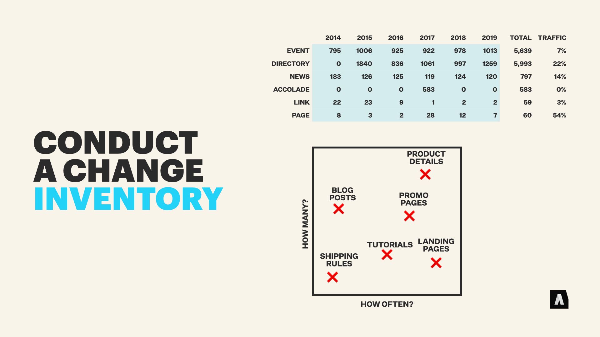
That kind of inquiry and the information you get from it can take different forms, but basic questions can provide a lot of value. Things like…
Has the fundamental definition of a kind of content changed? Like, has “article” grown to include legal documents with special needs, or has “products” grown to include subscriptions and digital downloads? Do we expect it to change again — or to keep changing over time?
Does the cadence of particular messages or content production change over time? Is it cyclical, or did we talk about one thing a lot last year, then stop entirely?
Does the quantity of a particular kind of content grow, or spike, or do we anticipate it exploding in the future?
The next actionable step is to look at your messaging and your content — and talk to other people in your organization, obviously — to identify stuff that straddles different rates of change, and has no good buffer to keep the changes from affecting each other.
Sometimes that’s as simple as calling out product pages that hard-code the company’s old color scheme into HTML. It can be subtler, too, like identifying departmental home pages that constantly feel out of date and out of sync with company-wide messaging.
These layer-straddling messages and content are usually where things break because something else changed, and coming up with ways to improve them will pay off over time.
Finally, talk to colleagues and leadership about this idea of “costly change,” that causes big ripple effects before everything blows up. Get them used to the idea of calling out “friction points” where change is likely to be expensive. Let them know about content that’s so ubiquitous in your library that changing the way it works, even for a good reason, will cause a tidal wave of work.
The idea isn’t to stonewall changes, but to help other members of your team understand the sometimes counter-intuitive ways these things are connected.
Now, I said we’d be talking about concrete “do it tomorrow” type stuff. But I also have three ideas that are more… general. Broad principles for content that can help you as you move forward with the “pace layer” way of thinking.
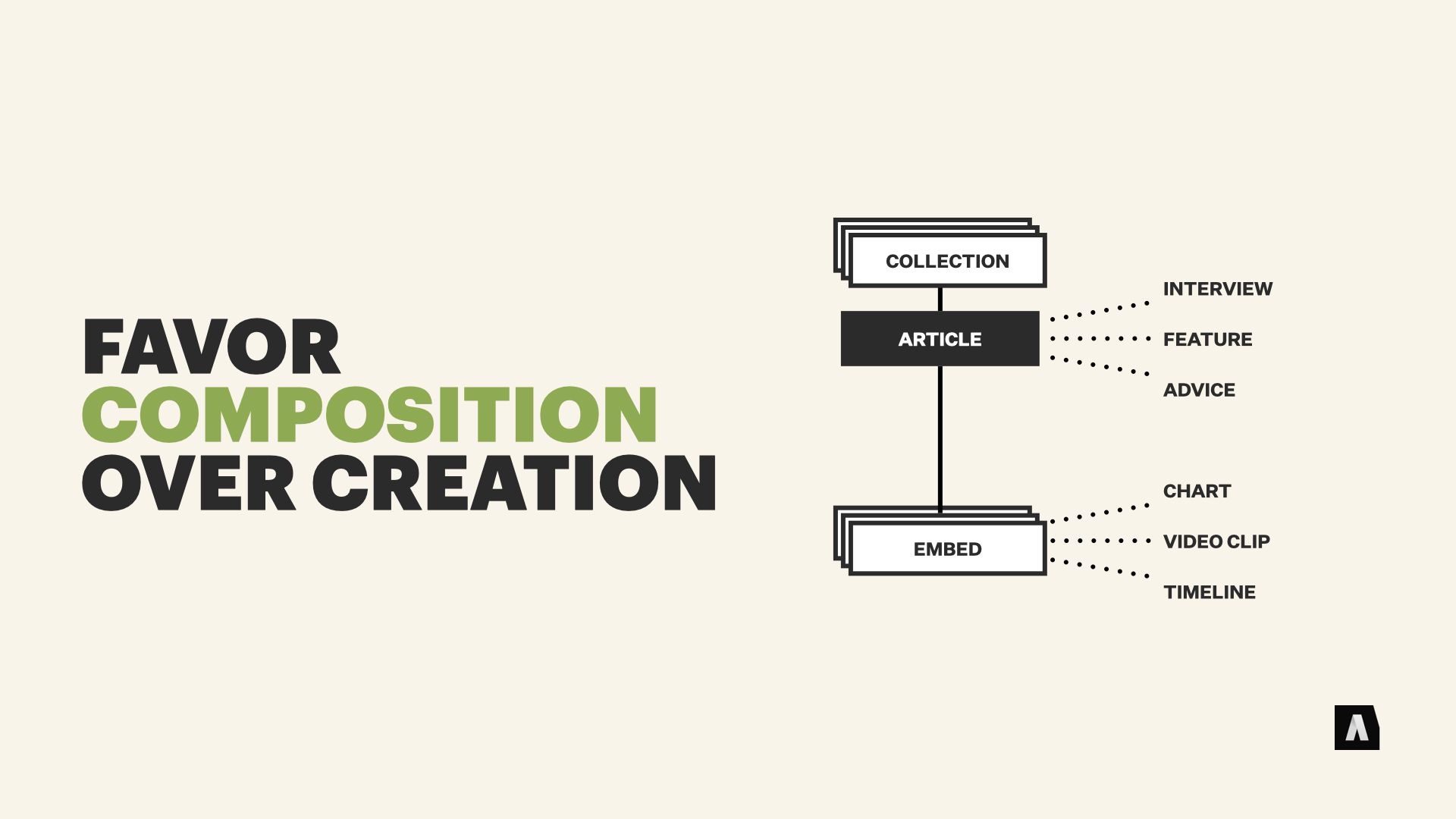
First, whenever possible, try to combine existing things you have in novel ways, rather than making a new thing from scratch. That’s the whole idea of “widgets” and “embedding” that I talked about earlier in the concept of growth and multi-purpose content. It can’t satisfy every need, but it can “satisfice” quite a few of them. And if you lean into this approach, often your new communication needs can be solved by creating a new container for old elements… or a new kind of element to add to your library of building blocks, rather than making something new and labor-intensive from scratch.
Next, refine what you know is going to stick around and don’t sweat the stuff that you know is seasonal or ephemeral. That applies to your workflow and your processes and to technical stuff like structured content models, too. As long as you have some buffers between those things, so that changes in one don’t break the other… you can afford imprecision and inconsistency in the stuff that only lasts for a few weeks.
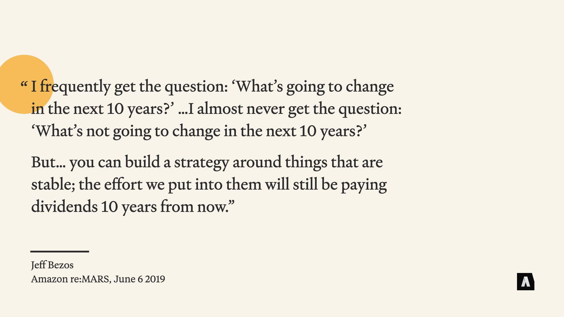
Now… Jeff Bezos is super problematic in terms of giving advice about sustainability, but I really love this quote. In a 2019 interview, he said:
“I frequently get the question: ‘What’s going to change in the next 10 years?’ …I almost never get the question: ‘What’s not going to change in the next 10 years?’ But… you can build a strategy around things that are stable; the effort we put into them will still be paying dividends 10 years from now.”
I can’t think of any better way to explain the importance of understanding the pace layers inherent in your content.
Finally… rather than trying to predict a very specific set of future needs and building towards that, use scenario planning approaches instead. Work with the rest of your team, look at the things that have changed in the past, and brainstorm ways that you think your needs or the needs of the people you’re communicating with might evolve in the future. The goal isn’t to predict what will happen — it’s to imagine a range of potential scenarios, and weigh the ways you’re approaching your content by how well they’ll cope with the potential scenarios you can envision.
For example, “we’ll hire more copywriters if demand ramps up” or “we’ll repurpose our existing podcasts as interview articles if we need more print content” are both better than “We’ll build our process around immersive VR microcontent for chatbots, because we think that’s the future.” The first two are ways to adapt as needs reveal themselves. The latter is a roll of the dice that’ll fit badly if things don’t turn out exactly the way your executives expected.
There are a million different angles to look at these issues from, and I feel like I’ve only scratched the surface, but I hope the idea of “pace layers” and looking at your content through the lens of time and change has started some wheels turning for you. I’d absolutely recommend grabbing a copy of How Buildings Learn; I can’t possibly do it justice.
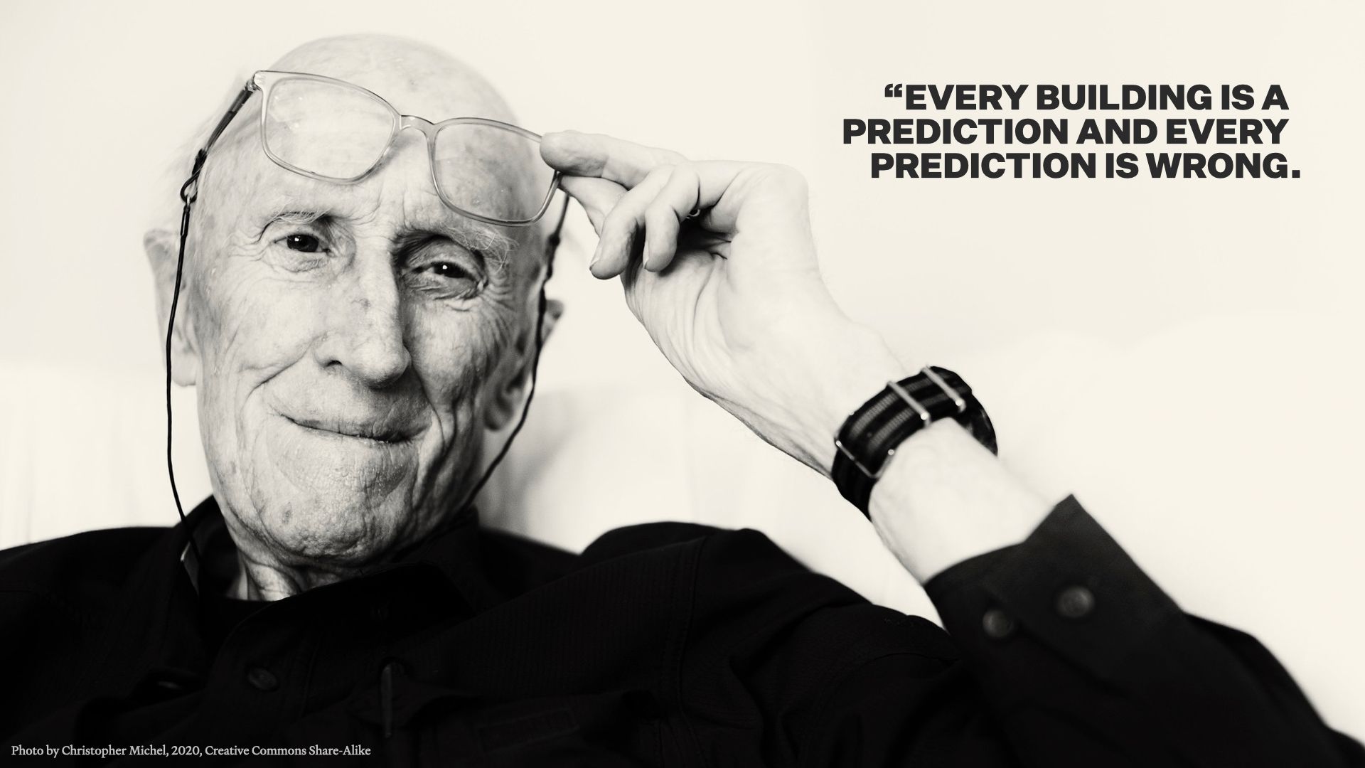
The only thing I can leave you with now is one of my favorite Stewart Brand quotes: “Every building is a prediction, and every prediction is wrong.” It sounds a little fatalistic at first, but in both architecture and content strategy it can be freeing.
We’re trying to get to good enough, not to perfect, and that means we can learn as we go.