
It’s really a pleasure to be here, and I hope we can have a good — exceptionally nerdy — time. This intersection that we’re talking about today — the relationship between content modeling — or ‘structured content’ in general — and the world of design systems is near and dear to my heart.
As design systems have grown in popularity, content strategy work has increasingly bumped up against them, and figuring out how to work effectively with the teams that build and use them can be a make-or-break proposition for big projects.
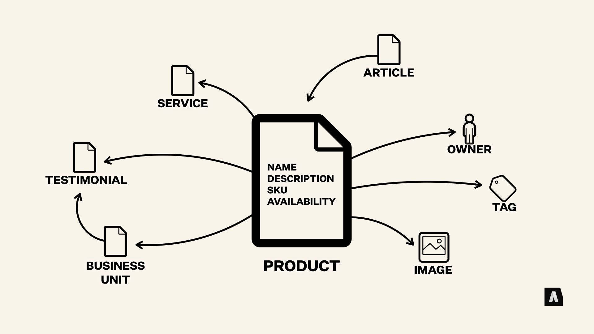
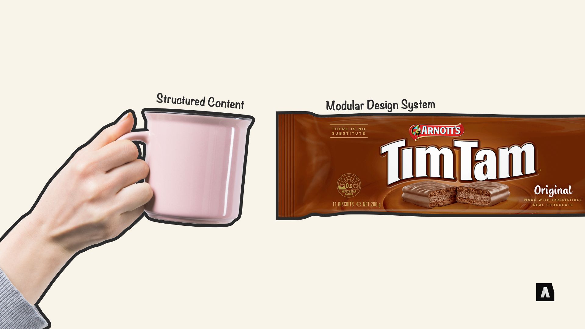
Understanding the connection between them kind of requires stepping back and quickly defining what we mean when we talk about both practices. I’m guessing that Content Modeling is the most familiar territory for us here — it’s the idea of building a kind of… map of the structures and relationships inherent in our content.
Getting everyone on the same page about those things means the content we produce can be more consistent, that it can be adapted to new uses more easily, and that when we have decisions to make, they’re more consistent, too. Honestly, that’s one of the biggest things in my mind — not just the technical details of spreadsheets and diagrams of our content types filled out, but establishing a real shared language that our teams can use to communicate about our own content.
…And that brings us to Design Systems. Now, depending on who you talk to, what someone means when they say “design system” can cover an awful lot of ground. Which, I guess, is one of the things they have in common with content models. Generally speaking, though, the focus is on bringing clarity and consistency and adaptability to visual and interaction design.
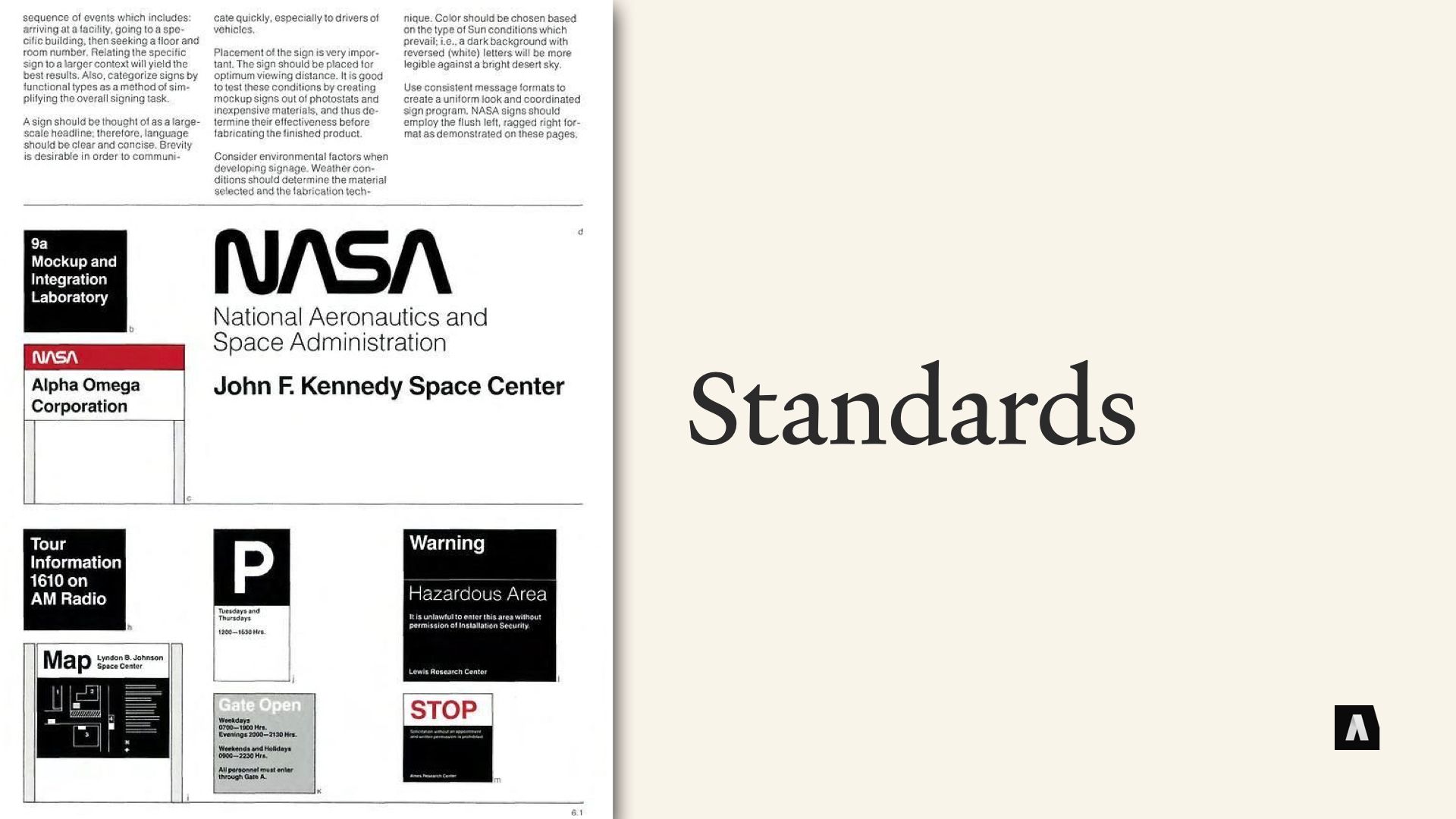
One big part of that is standards. Things like typography, spacing, color palettes, explicit rules for logo usage and iconography, all that jazz. This stuff has been around for a LONG time in the form of design style guides and “brand books” and “brand language guides” and things like that. NASA’s Graphic Standards Manual from 1975 is usually called out as one of the earliest, and it’s pushing 50 years old now.
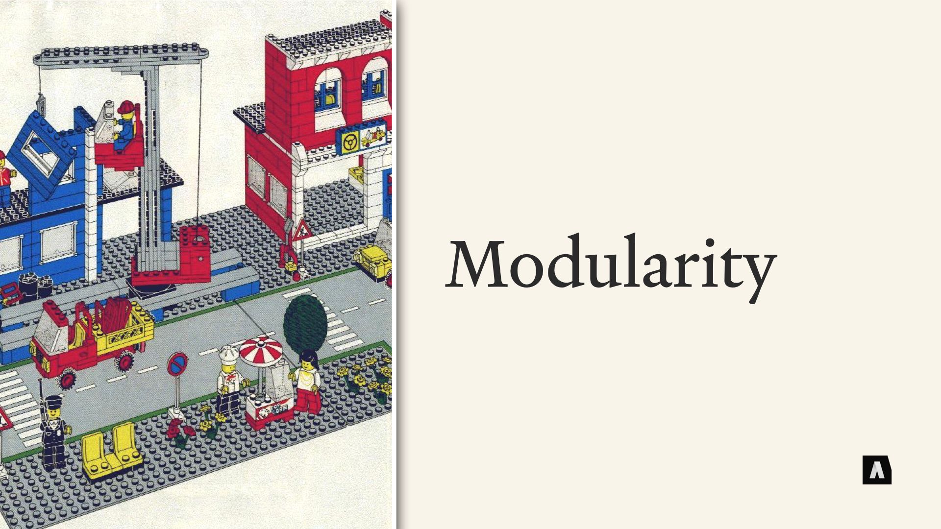
But a big part of the design system momentum revolves around something bigger than just visual standards. It’s the idea of creating and re-using modular design components — often referred to as patterns — across a project. So, rather than having a designer start from scratch every time you need to, say, show a list of articles on a web site, the team hammers out what “An Article List” should look like all across the site, spells out what kind of content it needs to populate itself correctly, and maybe defines a couple of visual variations to ensure it’s flexible enough for different use cases. And from that point on, they can just say, “Ah, we’ll drop an article list there” and everyone understands what needs to be done.
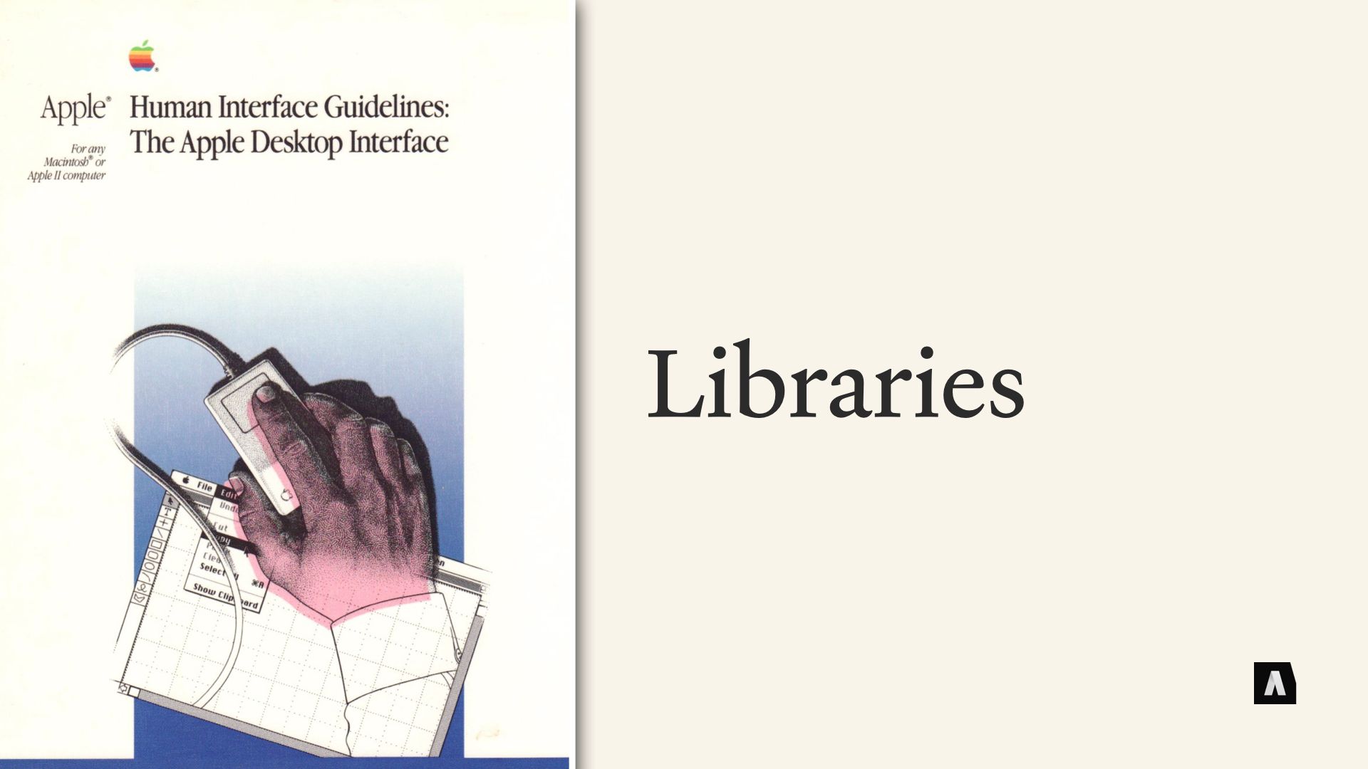
Again, this idea isn’t new — the original Macintosh UI in the 80s achieved a lot of its consistency by using a library of pre-built UI elements rather than letting each application’s developers reinvent the way a “button” works from scratch. And popular frameworks like Bootstrap got a lot of their value from the fact that they gave time-crunched web developers a pre-built library of visual building blocks to work with.
So… Although it’s not the totality of a design system, building up a project’s toolbox of reusable design elements — a “Pattern Library” — has turned into a pretty big focus for a lot of the design system community.
Finally, there’s a ton of interest in the Design System world around software tools that promise to simplify the work of maintaining and iterating and, well, just keeping track of all the moving pieces.
Tools that expose a design system’s inventory of patterns to apps like Sketch and Figma are really popular, because they let designers drag and drop those pre-fab patterns into place to mock up new stuff, rather than recreating them from specifications each time. Tools that maintain the documentation for a design system, and make the library of patterns browsable, are also hot stuff these days. And pre-built integration with web and mobile frameworks are really popular — having React components and iOS widgets for each design pattern ready to go means that if designers work with the existing components, actually coding and launching new stuff they’ve designed goes much faster.
Now, even without digging too deep there are a lot of obvious ways that design systems and structured content models compliment each other. The desire to define standardized, reusable elements — content types in our case, visual patterns in theirs — are driven by a need for consistency and clarity and efficiency. The carefully defined fields and properties and relationships of a content model often correspond to the individual properties in a design pattern — stuff like “Card title” and “Button text” and “Hero text.” What design patterns NEED in order to work is exactly what a content model HAS.
And teams that use design systems that way often think of things like “Pages” and “Page Templates” as assemblies of smaller patterns — much in the same way that we think about assembling dynamic content out of the elements of a rich content model. On paper, it’s a match made in heaven.
But. There’s always a but. In the real world there are a few pretty common scenarios where Design System teams and Content Strategy teams who are wrestling with structured content end up butting heads.
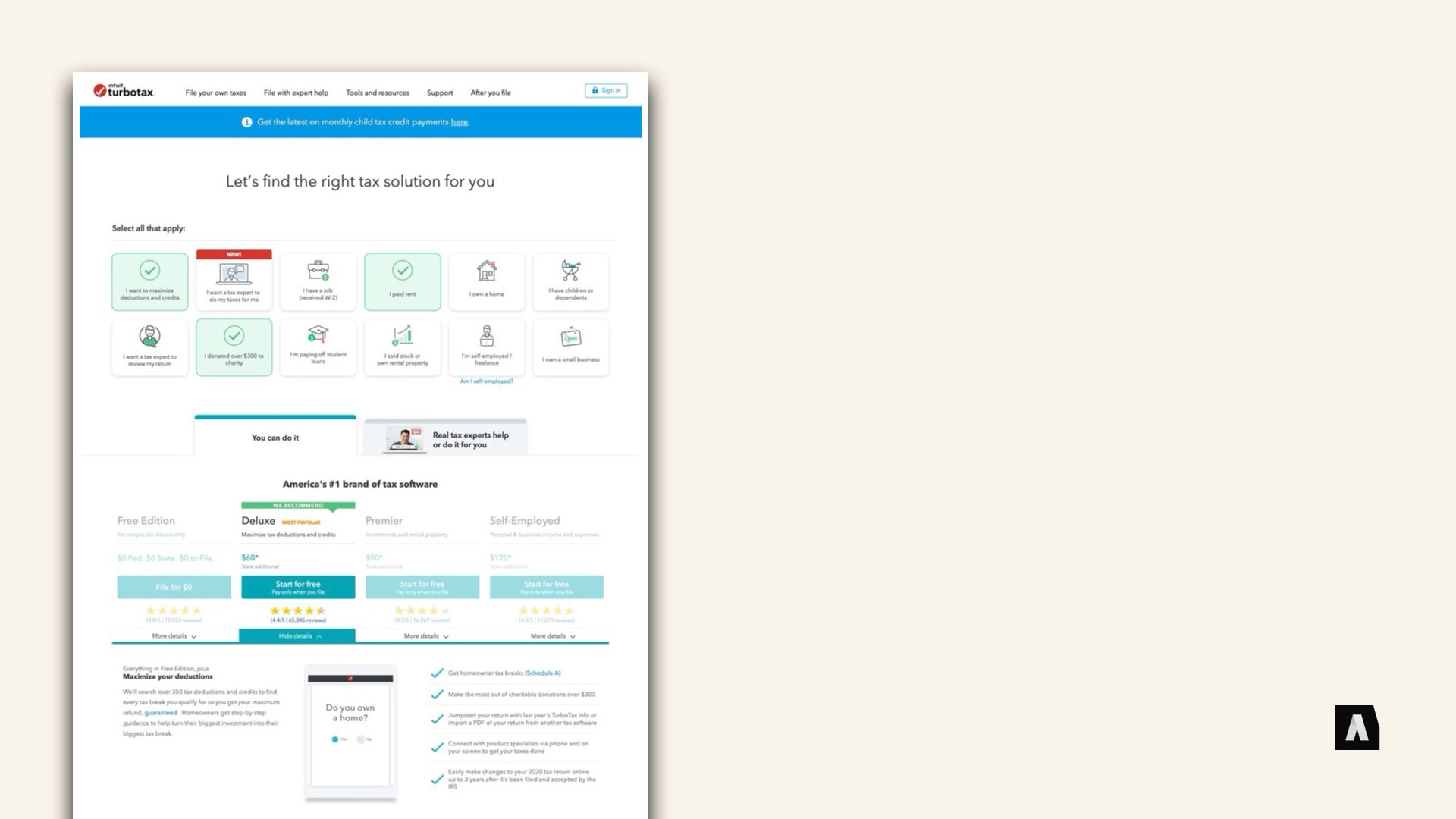
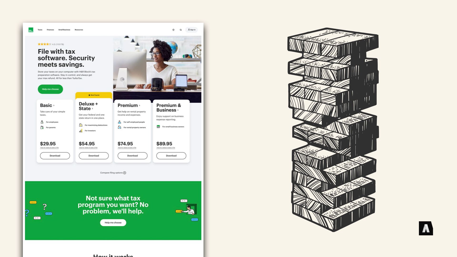
One reason — in my opinion at least — is that a lot of Design System experience comes from two pretty different spheres. The first is “application user experience design.” Stuff like, “We’re designing the user interface for a web app that lets you manage your finances.” The patterns (large and small) they focus on tend to be very task and interaction oriented — buttons, scroll bars, filtering widgets, pick lists, things like that. In the screenshot up there, the Turbotax web lets visitors click the kinds of needs they have, then uses those choices to spit out a list software packages that might be right for them. It’s a complicated design, but there’s really only one page like that — it should be consistent with other pages on the site, but what it’s doing is special and unique from all the other pages. Design systems whose rules and patterns priorities grow out of that side of things tend to place a lot less priority on rich, varied content — because the complexity lies in the one-off stuff.
The other side of the coin is designers and developers who cut their teeth building templates for content management systems. They’re concerned with a lot of the same things — making standard patterns for displaying certain kinds of information, ensuring that different types of templates follow consistent rules when they’re assembled together, things like that. But where the application UX folks often approach “design” as something that you assemble on a screen-by-screen basis, the CMS templating folks generally treat it as a kind of “pipeline” that your transforms your content into its final form.
To dramatically over-simplify things, the Application UX approach treats Design Patterns as something you build with, and content as something that populates the design you’ve created. The CMS Templating folks think of Content as something you build with, and design patterns as something that decorates or “presents” that content in a particular way. Those two views aren’t incompatible: In fact as long as everyone understands the differences, it can be a useful way to distinguish between the work that goes into highly interactive one-off stuff like “The User Sign-Up Form” from the templated, rule-based work that goes into high-volume stuff like “The Product Page Template.”

Increasingly, there’s kind of an uncomfortable middle zone that straddles those two extremes and makes it really tricky to figure out which perspective should dominate. At Autogram we’ve been calling it “High volume, high-variance” content. It’s stuff like, say, event landing pages or feature articles or topic landing pages that you have a lot of — so you can’t afford to design each one as a special snowflake, exempt from your normal content rules. But even though you have enough of them to need structure, they also demand a lot of unique variation — designs made by the editors of those pages, or the organizers of the events, about what should be present on the page and what should have priority and how to organize the information.
Sometimes, you can even get into this zone with a tiny handful of “special” pages — a home page that needs really precise design control, but should be in the hands of your content editors rather than dedicated HTML developers, feels this pressure too.
Traditionally when working with structured content and CMSs, these “special” pages were a place where the rules didn’t apply, or places where the rules got so complicated no one could keep track of them. “Yuck, just let the content editor use HTML and tell them not to break anything!” on the one hand, versus “Maybe we should add a million different fields to our ‘Special Everything Page’, so all the different variations can be kind-of captured in the fields.”
But with the rise of pattern oriented design systems, the idea of just letting content creators and editors assemble whatever design patterns they want into a custom page, right in the CMS, has become really more and more popular. Tools like Squarespace and Pods in Wordpress and Paragraphs in Drupal, that’s basically how they work — they turn the content editing experience into a “pattern-assembling” or “block stacking” experience.
There’s a lot to say for that approach, but it can also be really, really disastrous if it’s not done very carefully. Among other things, it essentially turns the library of visual components into the editorial content model. You might be storing structured content for each of the different page elements, rather than raw HTML, but the way that you’ve chopped it up and the decisions you’ve made about how things fit together are all built around the current design’s visual components.

I’ve worked with one organization — like, fortune 50, not amateurs — who went down that path and built out their entire CMS, with millions of pieces of content, to us their design system’s component library. Editors could create “Hero Treatment” content and “CTA Card” content and most pages were assembled out of stacked, horizontal design components they called “Bands.” If they wanted something new, nine times out of ten it meant just asking the design team to create a new kind of “Band.”
It worked… until they needed to do a design refresh that didn’t just add more and more options to the existing list of bands, but actually changed how things worked and how they were organized. And then they realized that literally every single piece of content would be broken by the new design. The content model was built around the bits and pieces of data that particular widgets needed in order to populate themselves, rather than the enduring messaging and communications patterns.
That problem — letting “editorial control” of pages turn the design into the defacto content model — is only one of the wrinkles, but I think it’s one of the easiest traps for cross-functional teams to fall into. Because it feels like very structured content when you’re modeling it out, and everything is full of forms and dropdowns instead of raw HTML.
A lot of the problems in this “design patterns drive the content model” approach spring from the assumption that there’s a 1:1 correlation between content types authors create in the CMS and design patterns that appear in a browser or mobile app. When the design is done first, and content types are defined to “fill in” the bits of information that need to change, it makes the model incredibly brittle. But when there are tons of highly-specialized content types and the designers are expected to make custom patterns for every single one, it’s just as brittle, the problems just land on someone else’s plate.
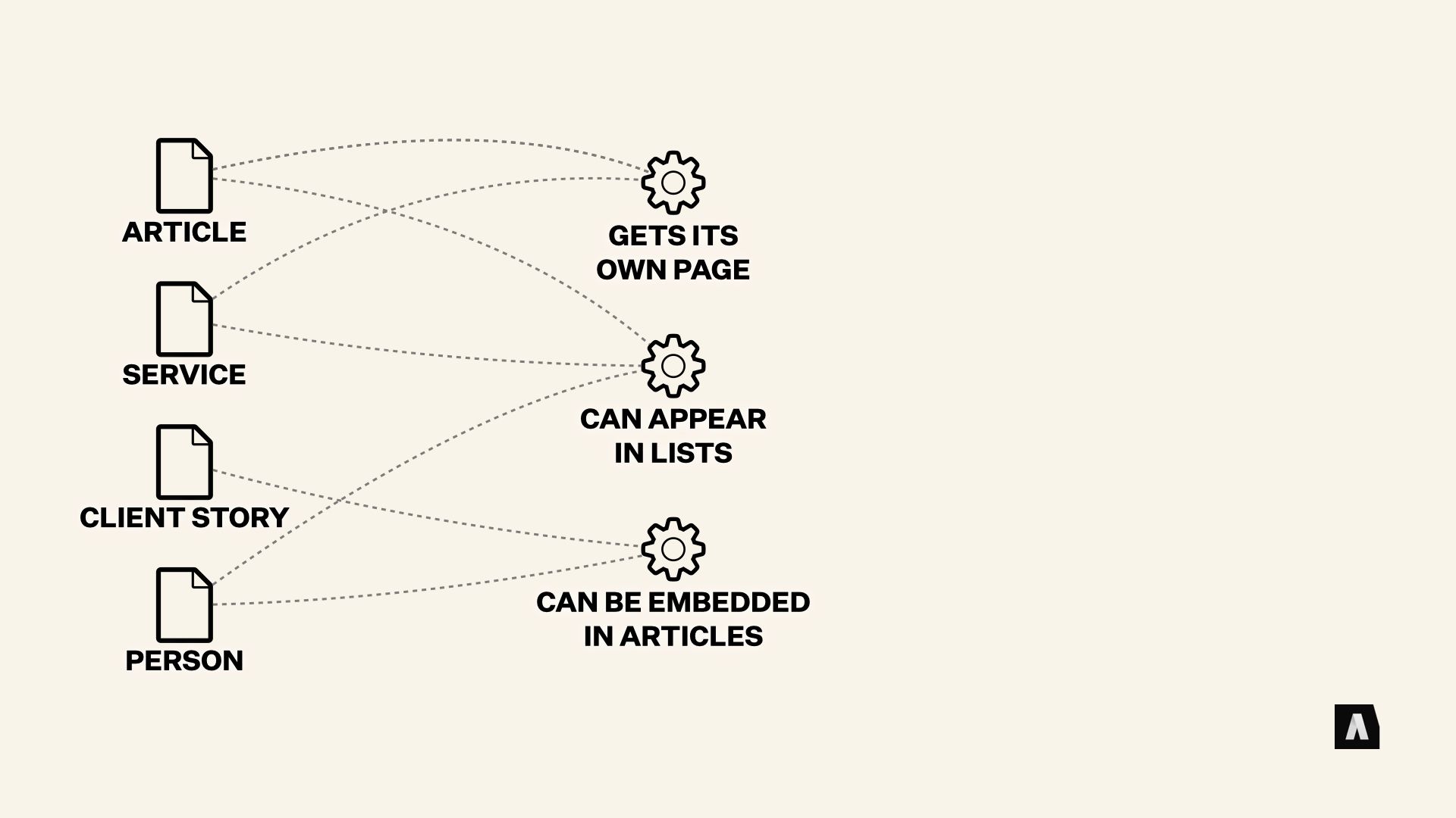
The alternative we’ve found works best is to put a kind of “buffer” between the two systems — our structured content model and the patterns of the design system. While it can feel a touch more complicated at first glance, what’s happening is important. Instead of the 1:1 content to pattern mapping we saw before, instead we have some basic “questions” about each piece of content. Things like, “does this get its own page?” and “can this appear in lists?” and “Can this thing be embedded in articles?”
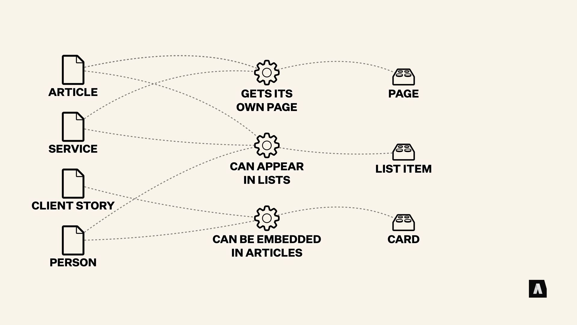
Those questions determine the kinds of patterns that a piece of content could be displayed in. They’re a kind of “promise” that the content will supply all the information necessary to be “a page,” or “an embed.” And then the design system can take those promises and turn them into decisions about what patterns to use.
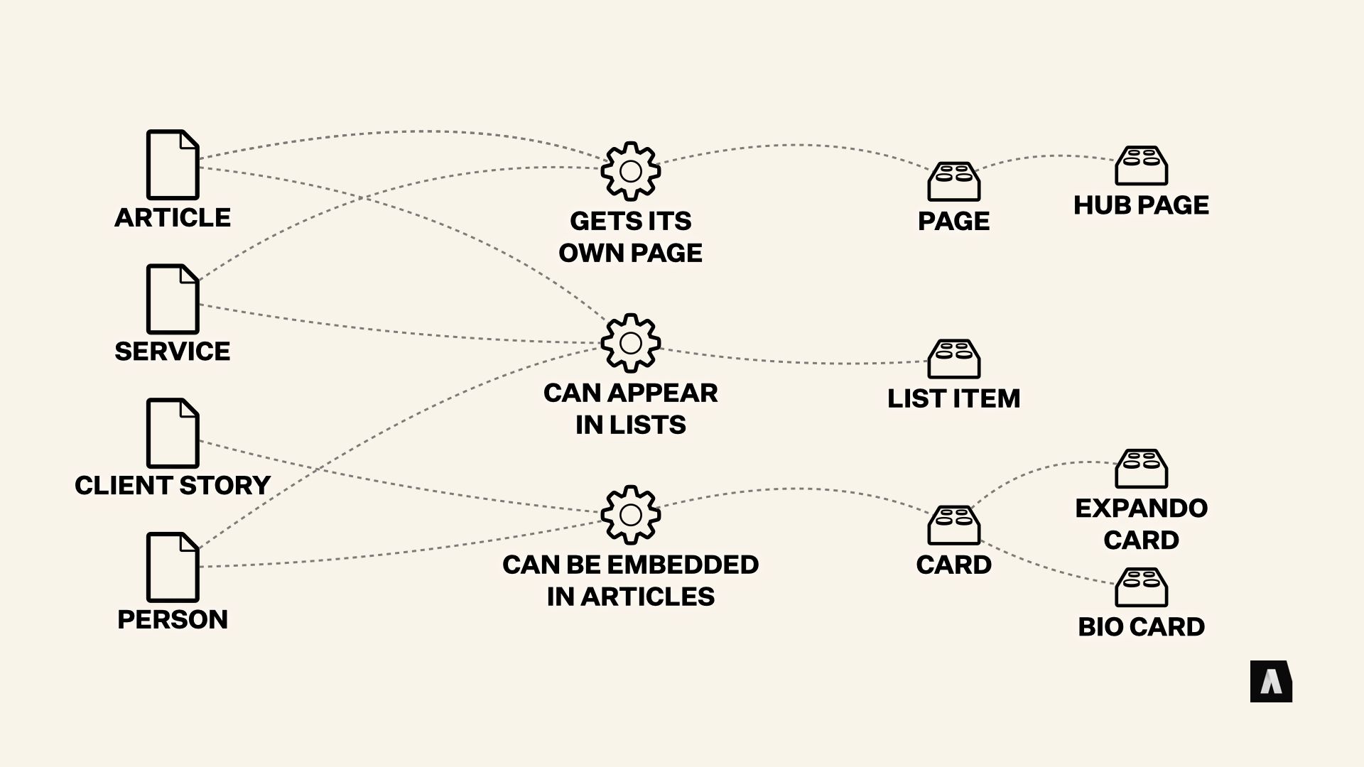
In some cases (say, lists) it might put every content type into the same display pattern. In others (say, cards) it might have special treatments for content that can supply additional stuff like an image or a link to a dedicated page.
When editors need to be in control of those special cases, rather than making special content types, the decisions they’re making — like, “this should be high-priority” or “This should always be next to that” — can be captured in structured fields on the content. The design system is still “responsible” for mapping those hints to different patterns and pattern variations, but the editors get to supply the information that drives it.

Now, this approach requires communication between the content and design teams. But it also allows both systems work with each other while growing and evolving at their own rates, without breaking everything.
It treats both systems as tools for communicating important information, and it forces both teams to develop a common language to talk about what they’re trying to accomplish — in the content and in the visual design.
Even if you’re working in a small team with a fairly simple design and pool of content, that kind of message - and purpose-based approach can make a big difference in the flexibility and longevity of both your content and your design system.

Now, I promised Angus that I wouldn’t let this turn into a gigantic rant about how design systems and content models are basically “linguistics” problems, otherwise we’d be here all day, but I hope this little bit of surface-scratching was interesting and/or enlightening.
Obviously, if you or your team are wrestling with these kinds of issues, we’d love to work with you, but we also really just love talking shop about this stuff. It’s a rapidly-developing field, and even though a lot of attention is focused on what big ENTERPRISE and STARTUP teams are doing with design systems, the questions they’re wrestling with affect those of us who work on smaller projects, too. It matters a lot.
And on that note, I’ll stop rambling and we can dive into some discussion! Thanks for listening.